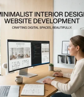
Clients ask us for “something clean and minimal” more than any other brief. Then they see the first draft and say it feels empty.
They’re usually right and the reason is almost never the amount of content. Minimal design isn’t less stuff. It’s fewer decisions, made far more carefully. With three colours and one typeface, there is nothing to hide behind: every spacing error is visible, every mediocre photograph is obvious.
DreamNexTech provides Modern and Minimal Coffee Shop Website Development Services where that restraint reads as expensive rather than unfinished. Here’s the difference in practice.

Modern and Minimal Coffee Shop Website Development Services
Simple means the structure is easy to follow — few pages, clear navigation, obvious next steps. Every good website should be simple.
Minimal is a visual style: restrained palette, generous space, limited typographic variation. A choice, not a universal good.
Empty is what happens when content is removed without craft replacing it. Three words and a photo isn’t minimal; it’s incomplete.
The gap between minimal and empty is made entirely of typography, spacing, and photography quality. Get those three right and a site you could describe in one sentence will look considered.
Typography Does the Heavy Lifting
Strip out colour and ornament and type becomes the design. What we do:
Two typefaces maximum — usually one serif for headings and one neutral sans for body, or a single variable sans used at multiple weights, which is cleaner still.
A real type scale. Not arbitrary sizes. We generate from a ratio of 1.25 or 1.333: 14 / 16 / 20 / 25 / 31 / 39 / 49 / 61. Consistent proportions read as designed even when nothing else is happening.
Larger headings than feel comfortable. A 56–72px hero headline on desktop is confident. 32px looks timid.
Body copy at 17–19px with 1.7 line height. Most sites set body text too small and too tight. Comfortable reading is itself a design feature.
Two weights only — regular and semibold.
Spacing Is the Other Half
The reliable fix: whatever section padding seems right, roughly double it.
Minimal design fails almost exclusively through cramping. Elements sit too close, sections run into each other, and the page feels tense.
We use a strict scale in multiples of 8 — 8, 16, 24, 32, 48, 64, 96, 128 — with no arbitrary values anywhere. Section padding runs 96–128px on desktop and 48–64px on mobile. Body copy sits in a container of 60–75 characters, because full-width paragraphs across a 1440px screen are unreadable no matter how good the type is.
Consistent spacing is invisible. Inconsistent spacing is noticed even by people who can’t explain why.
Three Colours, Not Four
A minimal café palette is a warm off-white background, a dark warm neutral for text, and one accent. Something like #FAF6F0, #2B2420, and a single terracotta or sage.
The discipline is not adding a fourth colour when a section feels flat — because when a section feels flat, the problem is spacing or type, not colour. We also warm both ends: pure white and pure black are the fastest way to make a minimal site feel cold and generic.
Twenty tested combinations, with the restrained ones marked, are in our colour palette guide.
Layouts That Suit This Style
Single-column centred. Everything in one narrow column. Easy to build, translates perfectly to mobile, looks deliberate.
Split hero, flat body. Image and text side by side at the top, simple stacked sections below.
Type-led hero. No hero photograph at all — large type on flat colour. Loads instantly and is the most modern option available. Also the least common, which is part of its value.
Asymmetric with deep margin. Content offset to one side with real empty space beside it. Requires nerve and a good reason.
Grid with generous gutters. Standard twelve-column with much wider gaps than usual.
We wireframe all of these in greyscale first, which matters more here than anywhere — if a minimal layout doesn’t hold up in grey boxes, no amount of restraint will rescue it. The process is in our layout and wireframes guide.
Photography, Used Sparingly
Fewer images means each carries more weight. We typically use three to five photographs across an entire minimal site, not twenty — each one genuinely good, all graded identically, and given real room rather than crammed against text.
Inconsistent photography breaks a minimal site instantly because there’s nothing else to distract from it. And in some sections, flat colour with well-set type is simply stronger than a mediocre photo, so we leave the photo out. Sourcing and grading are covered in our backgrounds and images guide.
Mobile First, Genuinely
A minimal site is often better on mobile — single column, big type, lots of space is exactly what phones want. So we design at 390px and expand outward.
Hero at around 70vh rather than full height. Type scaled with clamp() instead of breakpoint jumps. Section padding at 48–64px. A sticky bottom bar with Order and Directions. Tap targets at 44px minimum. Full detail on the top of the page is in our homepage and hero section guide.
Why Minimal Demands Better Development
This is the part worth paying for. Minimal design exposes sloppy implementation inconsistent spacing, fonts loading late and shifting the layout, images a few pixels out of alignment. On a busy site nobody notices. On a minimal one it’s all anyone sees.
So every build includes fonts subset and preloaded to eliminate layout shift, a spacing system implemented as tokens rather than hard-coded values, images in WebP and AVIF with correct srcset, tested contrast ratios, and Largest Contentful Paint under 2.5 seconds on a mid-range phone over 4G. Hand-coded, semantic HTML throughout — no page-builder output, because page builders cannot hold a spacing system consistently.
Is This the Right Style for You?
Minimal suits speciality shops, roasteries, and cafés with strong existing branding and good photography.
It suits less well the cafés whose charm is warmth and clutter — mismatched chairs, a noticeboard by the door, plants on every surface. Those deserve something with more texture, and we’ll recommend it: our aesthetic coffee shop website designs cover that direction, and the full range of styles sits on our coffee shop website design services page. Whichever you choose, the about us page and footer guidance applies equally.
Start Your Build
Two typefaces, three colours, one spacing scale, and more room than feels comfortable. Straightforward to describe and unforgiving to execute — which is exactly why it’s worth having built properly.
Get a quote from DreamNexTech. Send us your current site or just a description of your shop, and we’ll come back with a design direction, a timeline, and a fixed price.
High-end custom website development is our core service. Minimal café builds are where the difference between a template and a real build is most visible — because with nothing else on the page, the craft is all there is.