A designer hands you a beautiful Figma file. Three weeks later the developer hands back something that looks similar but breaks on iPhone, shifts as it loads, and takes four seconds to appear. Nobody’s at fault exactly the file was a picture, and a website is a system.
That gap is where most café website projects lose their money.
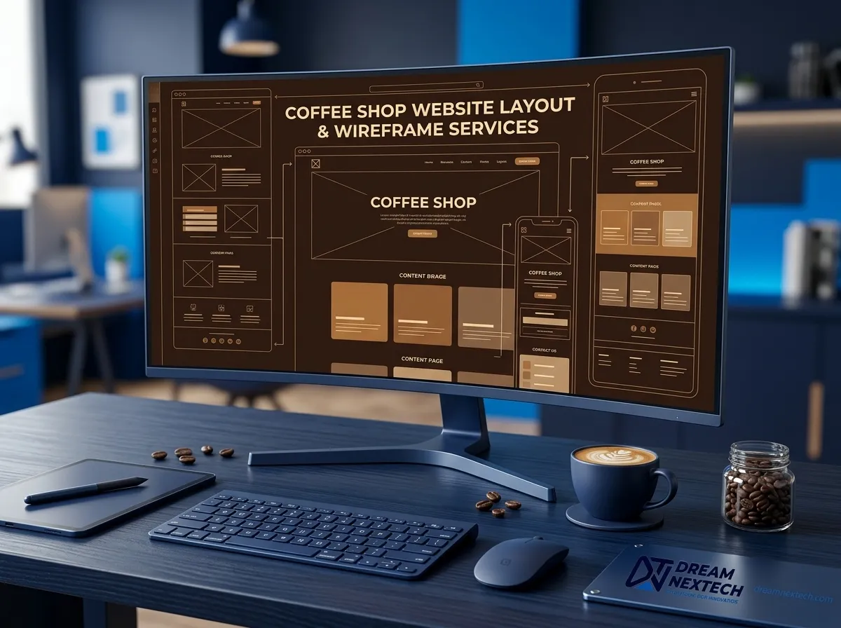
DreamNexTech handles both sides Coffee Shop Website Layout Wireframe Services. We wireframe, design, and build coffee shop websites end to end, or we take your existing Figma file and turn it into fast, responsive, hand-coded pages that behave exactly as designed. Here’s how the layout stage works and why it decides everything that follows.
We Wireframe in Greyscale First Always
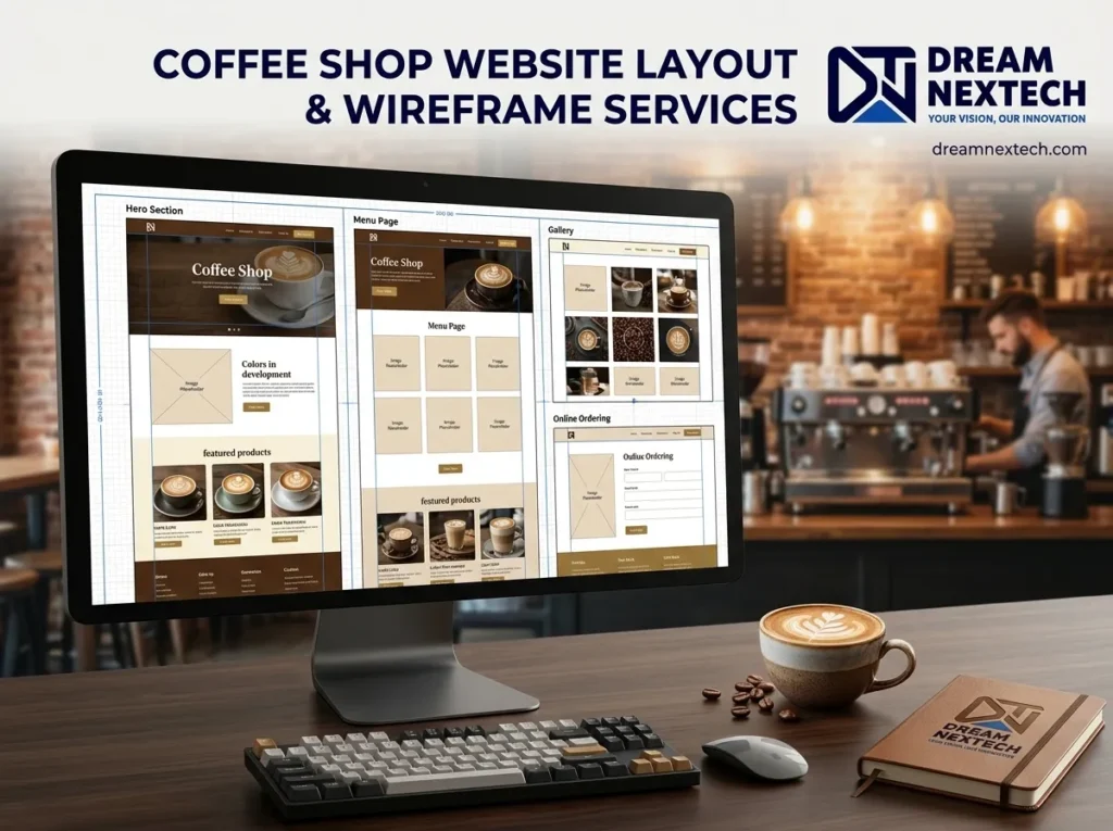
Before a single colour or photograph goes near a project, we build the entire coffee shop website layout in grey boxes with placeholder text.
It sounds like a step worth skipping. It isn’t.
If a page communicates clearly with no photography and no palette if you can tell at a glance what matters most the structure is sound. If it only works once a gorgeous latte-art photo is dropped in, the photo is doing the layout’s job, and the design collapses the moment your content changes.
It’s also the fastest way to iterate. Moving grey boxes takes seconds. Reworking a fully designed section takes hours, and clients pay for those hours.
The Structure We Build Every Café Homepage On
Nearly every effective coffee shop website homepage reduces to five blocks:
Hero. One image or colour field, the shop name, a one-line statement of what you are and where, one button.
Essentials strip. Address, today’s hours, tappable phone. A thin band directly under the hero. This single element answers the question most visitors arrived with, and it’s the block most café sites don’t have.
Menu preview. Three to six signature items with prices, linking to the full menu. A preview, not the whole list.
Story. Two or three sentences and a photograph of a real person, linking through to the full about page.
Location and footer. Map, directions link, hours repeated, contact details.
That’s a complete, functional café home page. Everything beyond it is enhancement and we’ll tell you honestly when an addition is enhancement versus weight.
Layout Variations Coffee Shop Website Layout Wireframe Services
Once the spine is agreed, this is where the character comes in:
Split-screen hero. Image one side, copy the other, stacking cleanly on mobile. Reliable and fast to build.
Full-bleed with scrim. Image filling the viewport under a dark gradient, white text centred. The classic café landscape composition.
Menu-first. No story block above the fold the drinks list leads. Suits speciality shops where the beans are the pitch.
Asymmetric editorial grid. Blocks spanning uneven widths on a twelve-column grid. Feels like a magazine and needs a confident hand.
Horizontal scroll gallery. A sideways image strip on desktop, converted to a swipeable carousel on mobile.
For finished examples of each, see our 30 coffee shop website design examples.
Mobile Is the Primary Layout, Not the Afterthought
Between seventy and eighty-five percent of café traffic comes from phones. People are standing outside deciding whether to walk another two minutes.
So we design at 390px first and expand to desktop, not the other way around. What that changes:
- Hero height drops to around 70vh full-height heroes on phones feel like a wall
- Every horizontal split stacks, with the order decided deliberately rather than by default
- Navigation collapses, but Menu and Directions stay reachable
- A sticky bottom bar with Order and Directions buttons, which consistently outperforms every other mobile pattern we’ve tested
- Tap targets at 44px minimum elegant thin links are a usability failure on touch
A desktop layout built outward from a working mobile design is always cleaner than a mobile layout squeezed down from desktop.
How We Structure Figma Files
If you’re working with your own designer, or you want a file you can hand to any developer later, this is the structure we deliver:
Wireframes page. Greyscale frames, mobile and desktop side by side.
Design system page. Colour styles named by role (bg/primary, accent/warm) rather than by hue. A full type scale. Spacing tokens in multiples of 8. Button components with hover, active, and disabled states.
Mobile screens. 390px frames, final design.
Desktop screens. 1440px frames.
Components page. Cards, navigation, footer, form fields all reusable with variants.
Two rules we don’t bend: auto-layout on everything, and properly named layers. A frame that falls apart when resized was never a design, just a picture of one. And hero-image instead of Rectangle 47 is the difference between a smooth handover and a week of clarifying emails.
Already Have Designs? We’ll Build Them
A large share of our café work is Figma-to-code. You bring the design file; we return a live, fast, responsive site that matches it precisely.
What that includes:
- Pixel-accurate implementation across every breakpoint, not just the two you designed
- Semantic, hand-written HTML no page-builder output
- Responsive images in WebP and AVIF with correct srcset
- Fonts subset and preloaded so nothing shifts as the page loads
- Accessibility checked, not assumed
- Core Web Vitals passing on mobile
We’ll also flag the things a static design file can’t express what happens when a menu item name runs to three lines, how the layout behaves at 320px, what the hover states should do. Those questions get answered before the build, not during it.
Where Layout Sits in the Full Process
Wireframing comes first, then everything else follows in sequence: typography, then the colour palette, then photography and backgrounds, then micro-details.
The individual pages each need their own layout thinking — the hero and homepage, the about page, and the footer. For restrained layouts specifically, our modern and minimal guide covers spacing and grid discipline in more depth.
Get Your Layout Built Properly
Whether you need Coffee Shop Website Layout Wireframe Services, or a developer to bring an existing Figma file to life, DreamNexTech handles the whole chain — and we hand back something you can actually maintain.
Send us your project with your Figma link or a description of what you need. We’ll review the file, flag anything that will cause problems in the build, and come back with a fixed quote and timeline.
High-end website development is one of the core services we offer, and café projects are among our favourites small enough to do exceptionally well, and they show up in real foot traffic.