
Here is a number that should worry every practice owner: the average healthcare website converts somewhere between one and three percent of its visitors.
Which means that if 1,000 people visit your eye clinic website this month, roughly 970 of them leave without calling, booking, or contacting you at all. You paid for that traffic — in SEO effort, in ad spend, in referrals, in reputation. And almost all of it evaporated at the interface.
Eye Clinic Website UI Design That Turns Visitors Into Patients is the discipline of recovering those people. Not by getting more traffic. By failing fewer of the visitors you already have.
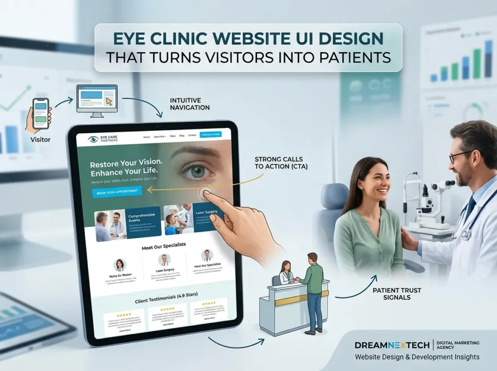
Conversion Is an Interface Problem, Not a Traffic Problem
Most clinics respond to weak results by buying more visibility. More ads, more SEO, more directory listings. It is the expensive answer.
Doubling a 2% conversion rate to 4% delivers the same result as doubling your traffic — at a fraction of the cost, permanently, and without ongoing ad spend. That is why conversion rate optimization for clinics starts with the interface.
Eye Clinic Website UI Design That Turns Visitors Into Patients
1. The visitor cannot tell what to do next. Homepages crowded with equal-weight buttons — Learn More, Our Story, Frames, Patient Forms, Insurance, Blog, Contact — paralyse people. Every screen needs one dominant action rendered in the highest-contrast element on the page.
2. Trust is missing at the decision point. Credentials on an “About” page do nothing for someone hovering over a booking button. Reviews, certifications, and reassurance must appear beside the conversion element, not three clicks away.
3. The form asks too much. Every additional field measurably reduces completions. You do not need date of birth, insurance member number, and full address to book an appointment. Get the name, the phone, the service, and the preferred time. Collect everything else at intake.
4. Mobile experience is an afterthought. Desktop-scaled buttons, non-tappable phone numbers, forms that trigger the wrong keyboard, and text requiring pinch-zoom. Every one of these is a booking lost.
5. Unanswered questions. Do you take my insurance? How much is an exam without coverage? Is parking available? Will my eyes be dilated? Can I be seen today? Silence on these points equals abandonment. Answer them on the page.
also check coffee shop website design.

Interface Patterns That Convert in Eye Care
A hero section that does one job. Practice name, location, primary offering, and a single high-contrast booking button — all visible before any scroll. Support it with one line of reassurance: “Same-week appointments · Most vision plans accepted · 400+ five-star reviews.”
A persistent mobile action bar. A fixed bottom bar with Call and Book, present on every page. This one component routinely produces the largest single conversion lift on clinic sites.
Service pages built as landing pages. Every service page should carry its own hero, symptom-led explanation, what-to-expect section, doctor credentials, FAQs, and its own booking form. A visitor arriving from a dry eye search should never have to navigate back to the homepage to book.
Insurance transparency above the fold on money pages. A simple logo strip plus a “not sure if you’re covered? call us” prompt removes the largest silent objection in healthcare.
Social proof rendered live. Embedded Google reviews with real names and dates convert far harder than typed testimonials nobody believes.
Urgency where it is genuine. “Next available: Thursday” or “Emergency eye care — same day” is honest urgency. Fake countdown timers destroy trust in a clinical context.
Our team applies these patterns in every build — you can see the interface craft in this responsive web page design work.
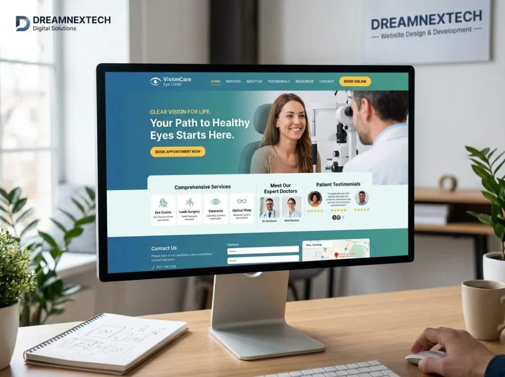
Designing for the Three Patient Types
Not every visitor is at the same stage, and one-size interfaces serve none of them well.
The urgent patient has a symptom right now — a foreign body, sudden floaters, an infection. They need a phone number and an emergency page instantly. Give them click-to-call above everything else.
The researching patient is considering LASIK, scleral lenses, or myopia management. They need depth: process explanations, candidacy criteria, pricing ranges, before-and-after outcomes, and doctor expertise. Then a low-commitment CTA — a free consultation rather than a booked procedure.
The routine patient needs an annual exam. They want speed and convenience: availability, location, insurance, and a two-tap booking flow. Any friction sends them to the next result.
A well-architected interface routes all three within seconds of landing.
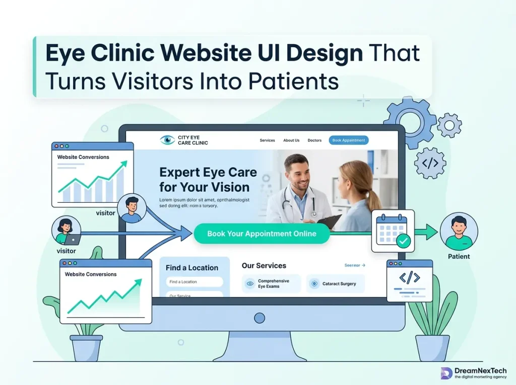
Test, Do Not Guess
Opinion-driven design is why so many clinic sites underperform. We instrument every build so decisions are evidence-based: heatmaps showing where attention actually goes, scroll depth revealing what nobody sees, form analytics identifying the exact field where people quit, and session recordings exposing the confusion no survey would capture.
Then we test — button copy, form length, CTA placement, hero messaging — and keep what wins.
Review the standard of work behind these builds in our developer’s full portfolio.
What a Conversion-Focused Rebuild Looks Like in Practice
The pattern we see repeatedly: a practice with reasonable traffic and poor booking volume. We rebuild the interface around a single conversion path, shorten the form, add a sticky mobile action bar, surface reviews and insurance beside every CTA, and split services into dedicated landing pages.
Traffic stays the same. Booked appointments do not.
That is the entire argument for treating UI as a revenue system rather than a visual exercise.
Stop Paying for Traffic You Waste
Every month your interface underperforms, you are subsidising competitors who simply made it easier to book.
Get a free conversion audit from DreamNexTech. We’ll analyse your eye clinic website’s interface, identify the exact points where visitors drop off, and show you what a conversion-engineered redesign would recover. No obligation, no jargon — just the numbers.
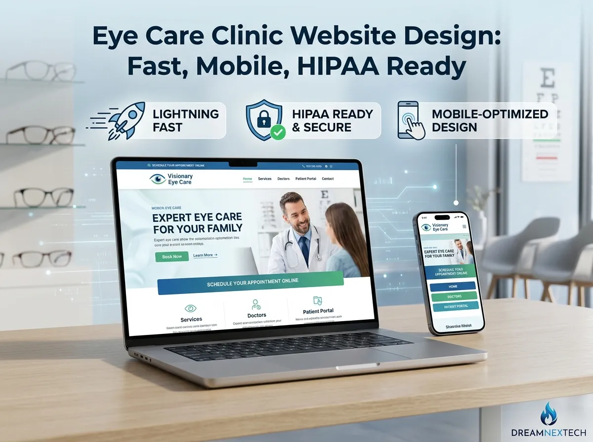
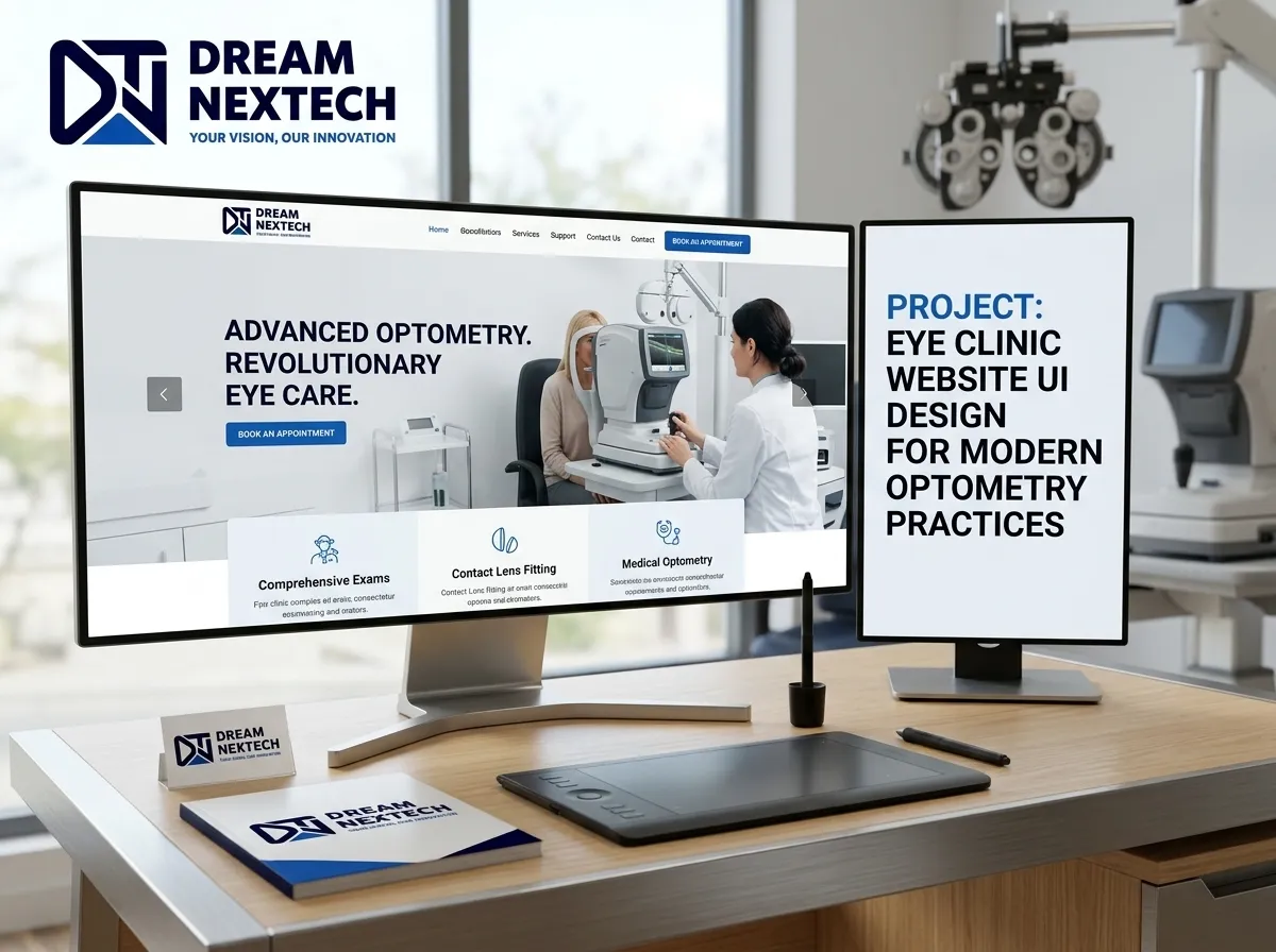



Eye Care Clinic Website Design And Development
[…] Typical eye care clinic builds run six to ten weeks depending on page count and integration complexity. You will know the number before you sign. Also check eye clinic website design. […]