
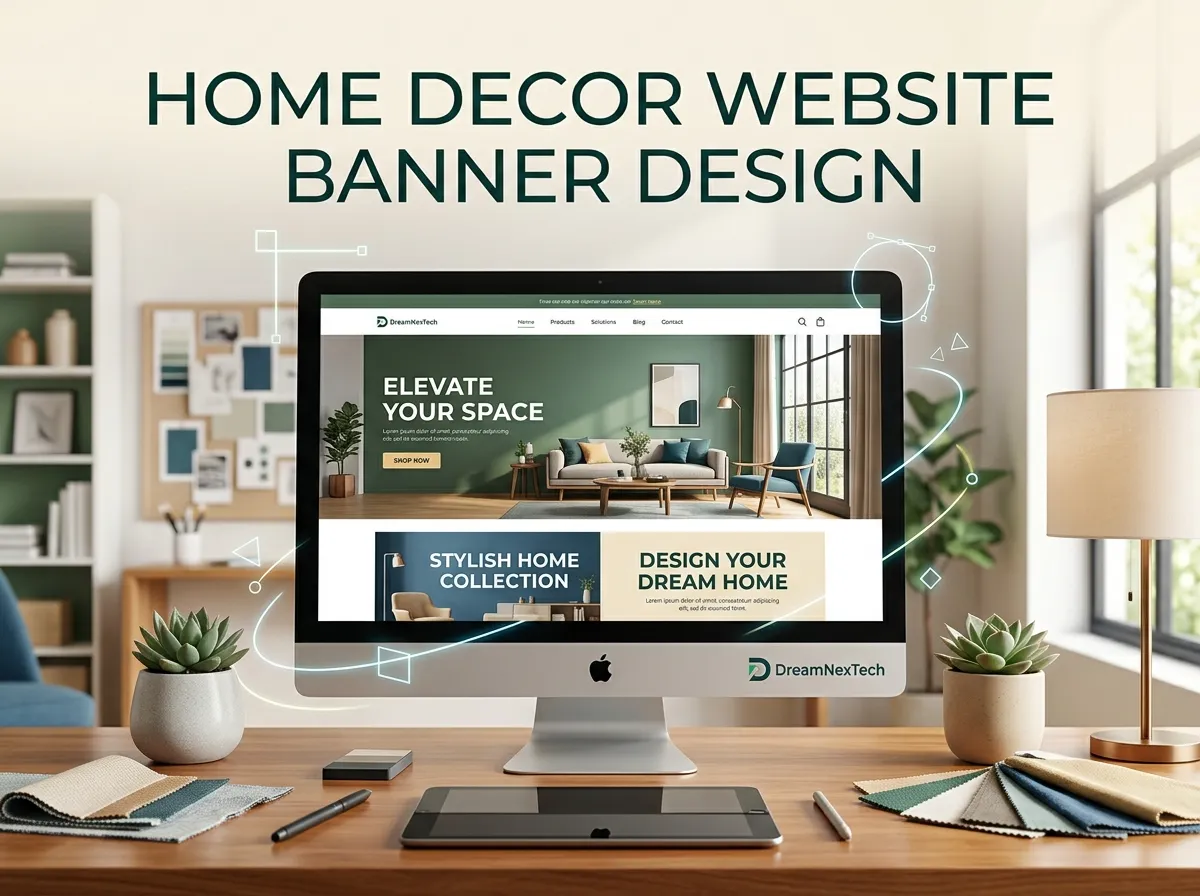
Your visitor decides in about three seconds whether your home decor store feels right. They don’t read your About page first. They look at your banner. So, get Home Decor Website Banner Design.
If that banner shows a blurry sofa, crowded text, and a tiny “Shop Now” button, they leave. If it shows a warm, well-lit living room with one clear message and a bold button, they scroll, click, and buy.
At DreamNexTech, we design home decor website banners that do the second thing. In this guide, we’ll show you what makes a banner work, share examples you can learn from, and explain how our team builds banners that turn browsers into buyers.
Hire Our Professional Services
Why Your Home Decor Banner Matters More Than You Think
Home decor is a visual purchase. People buy a lamp, rug, or throw pillow because they can picture it in their own home. Your banner is where that picture starts.
A strong hero section does three jobs at once:
- It tells visitors what you sell within seconds.
- It sets the mood of your brand, whether that’s cozy, luxury, minimal, or boho.
- It pushes visitors toward one action, like shopping a collection or claiming a discount.
When a banner fails at any of these, bounce rates climb and sales drop. That’s why we treat banner design as a conversion tool, not decoration.
Home Decor Website Banner Design Tips That Actually Sell
1. Lead With Lifestyle Photography
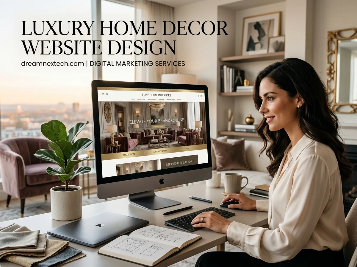
Product shots on a white background belong on product pages. Your banner needs styled scenes: a reading nook with your armchair, a dining table set with your ceramics, morning light across your linen curtains. Lifestyle imagery helps shoppers imagine ownership, and that’s what drives the click. check luxury home decor website design.
2. Keep the Headline Short
Aim for five to eight words. “Autumn Living Room Collection Is Here” works. A three-line paragraph doesn’t. Add a short subheading if you need to explain the offer.
3. Use One Clear Call-to-Action
“Shop the Collection,” “Explore New Arrivals,” or “Get 20% Off Today.” Pick one. When a banner offers four buttons, visitors often choose none. We design CTA buttons with strong contrast so they stand out against the photo.
4. Match Your Brand Color Palette
Earthy neutrals, sage green, terracotta, and warm beige dominate home decor right now. Your banner’s text overlays, buttons, and accents should pull from your brand palette so the whole site feels connected.
5. Design Mobile-First
Most home decor shoppers browse on their phones, often while relaxing at home. A banner that looks stunning on desktop can crop your best product out of frame on mobile. We build separate mobile crops and test every responsive banner across screen sizes.
6. Limit Sliders
Auto-rotating homepage sliders look busy and often hide your best offer on slide three. If you must use a slider, cap it at three slides with manual controls. In many cases, a single static hero converts better.
7. Optimize for Speed
Large banner images slow your site, and slow sites lose customers and search rankings. We compress images into modern formats like WebP, set proper dimensions, and lazy-load secondary banners so your homepage stays fast.
Hire Our Professional Services
Home Decor Banner Examples by Style
Different brands need different banners. Here are the banner styles we build most often.
The Seasonal Collection Banner: A full-width lifestyle image of a styled room, a headline like “Cozy Winter Essentials,” and a single “Shop Now” button. Ideal for driving traffic to new launches.
The Minimal Luxury Banner: Lots of white space, one hero product (like a marble side table), a thin serif font, and a subtle CTA. This style suits high-end furniture and designer decor brands.
The Promotional Sale Banner: Bold contrast, a clear discount figure, and a countdown timer. Perfect for Black Friday, Eid sales, or clearance events.
The Split-Screen Banner: Image on one side, text and CTA on the other. It works well on mobile because the text never sits on top of a busy photo.
The Video Hero Banner: A short, silent loop of a room being styled or fabric moving in the breeze. It feels premium, but we only recommend it when the video is compressed properly.
Common Banner Mistakes We Fix for Clients
Many store owners come to us after their DIY banner stops performing. The usual problems:
- Text placed over busy areas of the photo, making it unreadable
- Stock photos that look generic and don’t match the products
- Buttons that blend into the background
- Banners that aren’t updated for seasons or sales
- Heavy image files that drag down page speed
Each of these costs you sales quietly. The fix is usually simple once a professional designer looks at it.
How DreamNexTech Designs Home Decor Banners
We don’t just drop an image and some text into a template. Our process is built around conversions.
Step 1: Brand and Goal Review. We learn your products, audience, and the single action you want visitors to take.
Step 2: Visual Direction. We choose imagery, fonts, and colors that match your brand style.
Step 3: Design in Figma or Photoshop. You see a desktop and mobile mockup before any code is written.
Step 4: Clean Development. Our developers turn approved designs into fast, responsive code. If you already have a banner design file, we can convert your PSD to HTML with pixel-perfect accuracy.
Step 5: Testing. We check load speed, readability, and layout on phones, tablets, and desktops.
You can see banners and full sites we’ve built for real businesses in our web design portfolio.
Ready for a Banner That Sells?
Your banner is the first handshake between your brand and your buyer. Make it count. Whether you need one hero section redesigned or a full set of seasonal banners, DreamNexTech builds home decor website banners that look beautiful and drive sales.
Stop losing visitors in the first three seconds. Let’s build a banner that gets them clicking.
How To Create A Website For Home Decor Business
[…] Your answers shape everything that follows. A luxury furniture brand needs a very different site than a small candle and decor shop. Home decor website banner design. […]