
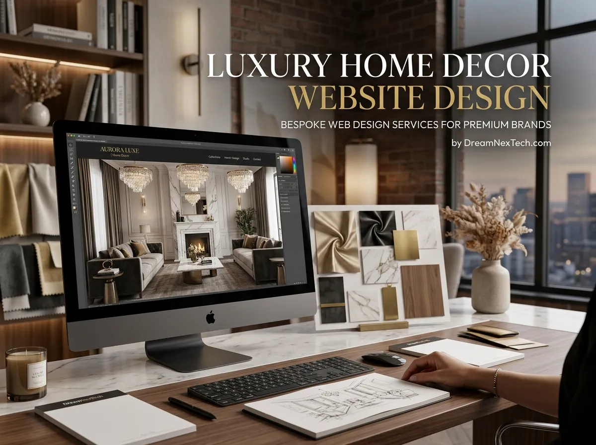
A $2,000 Console Table Cannot Be Sold On A $200 Website
Price is a promise. When a visitor lands on your store and sees stock photography, cramped spacing, and a generic theme, the promise breaks before they reach the product page. They do not argue with your price. They just leave.
Luxury home decor website design exists to close that gap. It is not decoration for its own sake. It is the visual evidence that your pricing is justified.
DreamNexTech builds these stores for high-ticket decor, furniture, lighting, and artisan homeware brands. Here is how we approach it.
Hire Our Professional Services
Luxury Home Decor Website Design
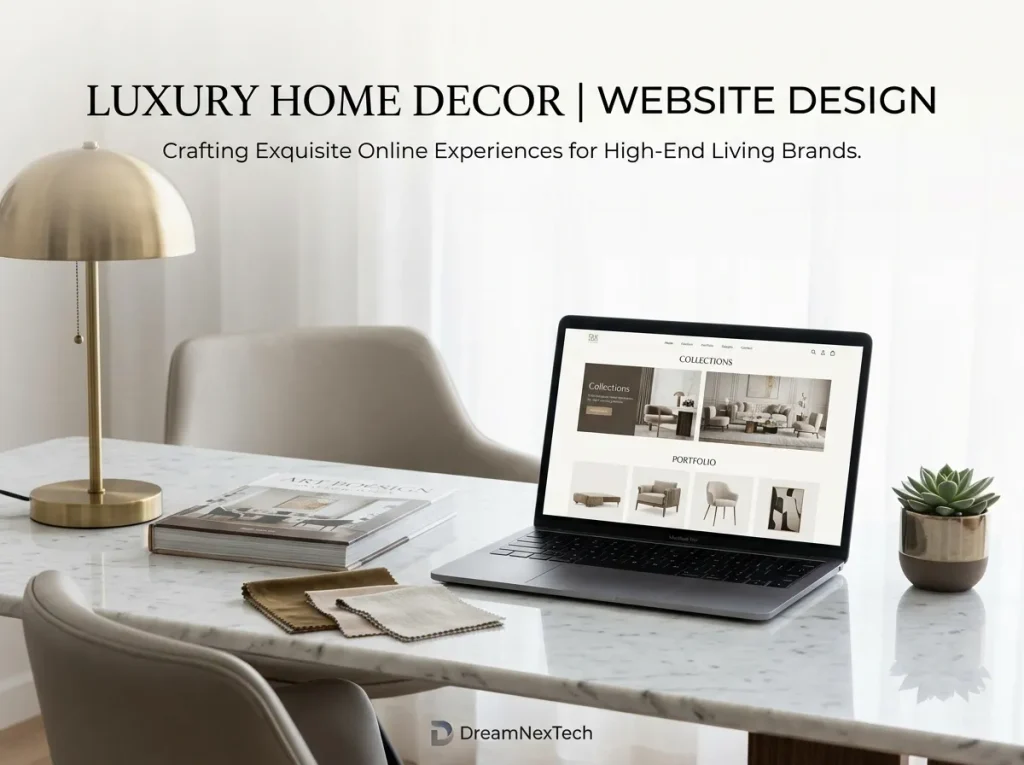
Space is the most expensive element on the page. Budget stores fill every pixel. Premium stores leave room. We increase padding, widen gutters, and reduce the number of products per row. Fewer items, larger frames, more breathing space.
One message per screen. A luxury homepage does not shout six offers at once. Each scroll section makes a single point, then hands the visitor to the next one.
Restricted palette. Usually two neutrals and one accent, sourced from your product photography. Warm stone, deep charcoal, muted brass. No loud discount badges.
Editorial typography. A refined serif for headlines paired with a clean sans for body text, set at generous line height. Type size and spacing do more for perceived quality than any graphic effect.
Motion that is slow. Subtle fades, gentle parallax, unhurried transitions. Fast, bouncy animation reads as cheap. Slow motion reads as considered.
The Hero Sets The Price Bracket
The Home Decor Website Hero Image on a luxury store is the single most consequential asset on the site. We treat it as a photoshoot brief, not a stock search.
Our rules for it: one styled room, natural directional light, one hero product clearly in focus, and negative space on one side where the headline and button sit. No text baked into the image, so it stays crisp and translatable on every screen size. We export separate desktop, tablet, and mobile crops so the composition never breaks.
Underneath, the headline stays short. Three to six words. The button says something specific like “Explore the Collection,” never “Click Here.”
Trust Infrastructure For High-Ticket Buyers
Someone spending four figures online needs more reassurance than someone buying a candle. We build that reassurance into the layout:
- Material provenance and craftsmanship notes on every product page
- Dimension diagrams and scale-in-room renders
- Named maker or atelier stories
- Delivery, white-glove installation, and returns policy stated plainly
- Real customer photography, not just star ratings
- A visible contact route, because high-ticket buyers often want to talk first
We also add a concierge or enquiry path parallel to the standard cart, so buyers who want a conversation are not forced through a checkout they are not ready for.
Hire Our Professional Services
Performance Is Part Of The Luxury
Here is where most premium decor sites fail. They load huge uncompressed imagery, stack four fonts, and take eight seconds on mobile data. A slow site does not feel expensive. It feels broken.
We solve it with next-gen image formats, responsive image sets, font subsetting, deferred scripts, and a critical CSS path. The visual richness stays. The load time drops. Our target is a largest contentful paint under 2.5 seconds even on image-dense pages.
Because pixel-accurate execution matters at this level, we also handle responsive web page design and editing for brands who have a premium design already and need it built or refined without losing the detail.
Banner And Background Treatment At The Premium Tier
Luxury banners are quiet. We design a home decor items website banner for high-end brands using the same compositional language as the hero: real photography, minimal type, one action. Seasonal promos are handled with typography changes, not with starbursts and red sale ribbons.
For section backgrounds, we choose a background image for home decor website blocks that sits at low contrast behind content. Usually a soft texture, a blurred interior, or a flat tonal wash pulled from the product palette. Text always clears WCAG contrast standards, because unreadable elegance is just unreadable.
Our Build Options
- Shopify Plus for scaling premium brands with complex fulfilment
- Custom WordPress and WooCommerce for content-led luxury brands with editorial ambitions
- Fully bespoke front-end builds where the design does not fit any existing theme
- Design-only projects, delivered in Figma with a full component library if you have an in-house dev team
Timeline, Scope, And What Happens Next
A luxury build typically runs four to eight weeks. Week one is discovery and brand audit. Weeks two and three are art direction, hero concepting, and homepage design. Weeks four and five cover the remaining templates. The rest is development, QA, SEO, and launch.
You get a fixed scope, staged approvals, and a single point of contact throughout. No surprise invoices.
If you sell premium decor and your website is not carrying the same weight as your products, that gap is costing you conversions every day it stays open. Look through our previous work, then send us your brief.
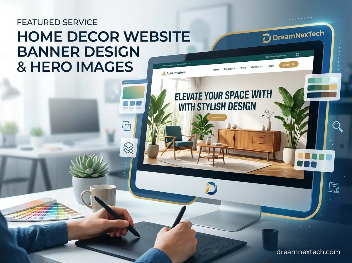

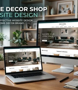
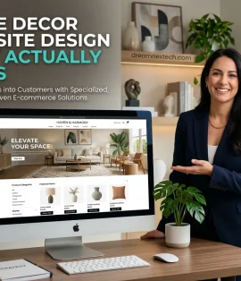
Home Decor Website Banner Design And Hero Images
[…] Composition with negative space. The image needs a quiet zone where the headline and button can sit without fighting the visuals. We compose or crop for this deliberately rather than dropping text over a busy centre. Check out Luxury Home Decor Website Design […]