
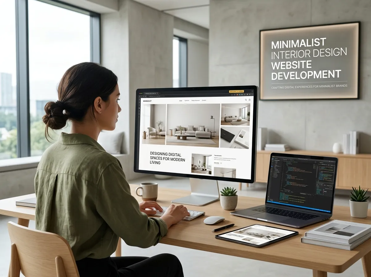
Minimalism is the most misunderstood direction in web design. People think it means less work. In practice, a minimalist interior design website is harder to build than a busy one, because every remaining element has to be perfect.
There is nowhere to hide when you remove the decoration.
Hire Our Professional Services
Why Minimalist Interior Design Website Development?
Interior photography is detailed, textured, and colorful. A busy interface competes with it. A minimal interior design website gets out of the way and lets the rooms perform.
Minimalism also signals confidence. A site showing four projects with no clutter suggests a studio that selects its clients. A site with twenty sections suggests one still searching for direction.
For designers working in Scandinavian, Japanese, or contemporary styles, a simple interior design website is not just a preference. It is brand alignment.
The White Space Principle
White space is the core material of minimalist web design, exactly as negative space is in a well-designed room.
Practical guidelines: give sections at least 100 pixels of vertical breathing room on desktop, keep body text to a comfortable measure of 60 to 75 characters per line, leave wide margins on both sides of content, and never fill a gap simply because it looks empty.
If a section feels too spacious, wait a day and look again. Most designers under-space rather than over-space.
Typography Is the Design
When you strip away decoration, interior design website font choices carry the entire visual identity.
Pair one serif with one sans-serif, or use a single family across two weights. Set headlines large, at 40 to 72 pixels on desktop, and body text at a generous 17 to 19 pixels. Use line height around 1.6 for readability.
Serif headlines suggest heritage and craft. Geometric sans-serifs suggest modernity and precision. Humanist sans-serifs sit comfortably between the two. check out luxury interior design website development.
Avoid: more than two families, thin weights at small sizes, all-caps body text, and justified alignment.
Building a One Page Interior Design Website
A one page interior design website is a natural fit for minimalism, especially for solo designers or new studios.
A workable structure runs: hero with a single image and statement, a short introduction, three to five featured projects presented in sequence, a condensed services list, one testimonial, and a contact block.
The advantages are focus and simplicity. The limitation is SEO, since a single page can only target a narrow set of search terms. A common compromise is a one-page home experience with separate project and service pages behind it.
Interior Design Website Icons and Interface Elements
In a minimal build, interface elements should be almost invisible.
Interior design website icons, if used at all, should be thin-line, monochrome, and consistent in weight. Use them only where they genuinely aid comprehension, such as in a process section or contact details.
Buttons can be simple text links with a thin underline rather than filled rectangles. Borders can be single hairlines. Shadows are rarely necessary.
The test: remove an element and see whether anything is lost. If not, leave it out.
Hire Our Professional Services
The Classic Eye-Catching Opening
A minimalist site still needs an arresting entry. The classic approach for an interior design portfolio website is a single full-screen image, your studio name set small in one corner, and a short line describing what you do and where.
No slider. No overlay text competing with the photograph. No scroll prompt animation bouncing at the bottom.
That restraint is precisely what makes it eye-catching. Visitors arriving from a web full of noise notice silence immediately.
Structuring Project Pages Minimally
Minimal project pages follow a simple rhythm: title, location, one paragraph of context, then images at full width separated by space.
Resist adding sidebars, related-project carousels, or social share buttons on every image. Place a single quiet link to the next project at the bottom.
Interior Design Website Footer Design
The interior design website footer in a minimal build should be short and useful. Include your studio name, email address, phone, city, one or two social links, and a copyright line.
Skip the four-column footer with every page repeated. A minimalist footer often works best as a single centered block with generous padding above it.
Mobile Minimalism
Minimal designs translate well to mobile because they were never dependent on wide layouts.
Still, check a few things: headline sizes scale down proportionally, images stack cleanly without awkward cropping, the navigation opens smoothly and closes easily, and white space is reduced slightly so pages do not require excessive scrolling.
Responsive behavior is where minimal designs usually break. If your layouts need refining across devices, you can have responsive web pages designed and edited for your site.
Performance Is Part of Minimalism
A visually minimal site built on a bloated page builder is not actually minimal. Clean code matters as much as clean layout.
Limit custom fonts to two files, avoid animation libraries you barely use, compress images aggressively, and remove unused CSS. The result is a site that loads quickly, which itself feels refined.
For a build that stays lightweight from the start, you can commission a complete website developed properly rather than retrofitting speed later.
Common Minimalist Mistakes
Minimalism goes wrong in predictable ways: text so light it becomes unreadable, navigation so subtle visitors miss it, contact information hidden for the sake of cleanliness, and project pages with no written context at all.
Minimal means reduced, not vague. Clients still need to know what you do, where you work, and how to reach you.
Final Thought
A minimalist interior design website works because it mirrors good interior design: considered proportions, quality materials, and nothing present without reason.
Strip your site back to what matters, then execute those few elements immaculately. If you want that executed with clean code and careful detail, see the full service range at talha_jamil on Fiverr.
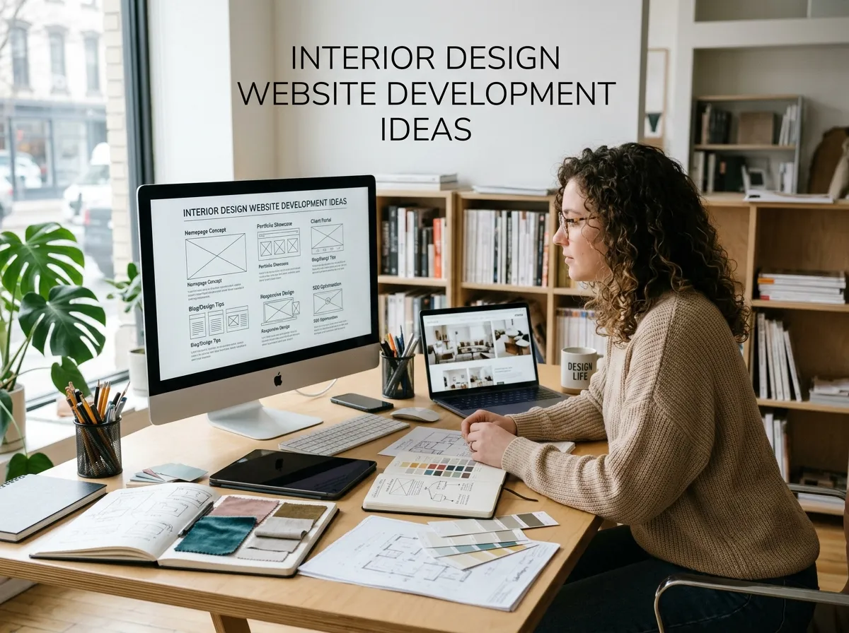
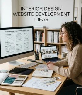
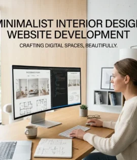
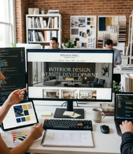
Interior Design Website Development Ideas: Inspiration, Aesthetic & Layout Examples - DreamNexTech
[…] An interior design website green palette, especially sage or deep forest, communicates natural materials and biophilic design. An interior design website orange accent brings energy and warmth, effective for studios working in mid-century or Mediterranean styles. An interior design website red accent is bold and best used sparingly, on buttons and hover states only. minimalist interior design website development. […]