“Founded on a passion for quality, we source ethically and serve with a smile.”
We’ve read that sentence, or something almost identical, on roughly two hundred café websites. Nobody has ever finished reading it and decided to visit.
The about page is the most-skipped page on weak café sites and the most-read page on good ones. The difference is whether there’s an actual person on it.
DreamNexTech designs and writes Coffee Shop About Us Page Design that give strangers a reason to walk over — real names, real details, real photographs, laid out so the page gets read rather than scrolled past. Here’s how we build them.
Coffee Shop About Us Page Design
People land on your about page for one of three reasons: they liked the look of the shop and want to know whether the people seem decent; they’re deciding between you and a café two streets away; or they’re a journalist, supplier, or potential hire looking for real detail.
All three want the same thing — specificity. Where the beans come from. Who runs the place. Why it opened. What’s genuinely different.
Vague warmth converts nobody. “Sara left a fifteen-year nursing career to open this place in 2019 after her mother’s cardamom coffee recipe got out of hand” does more work than three paragraphs about passion, because only you could have written it.
Four Layouts We Build
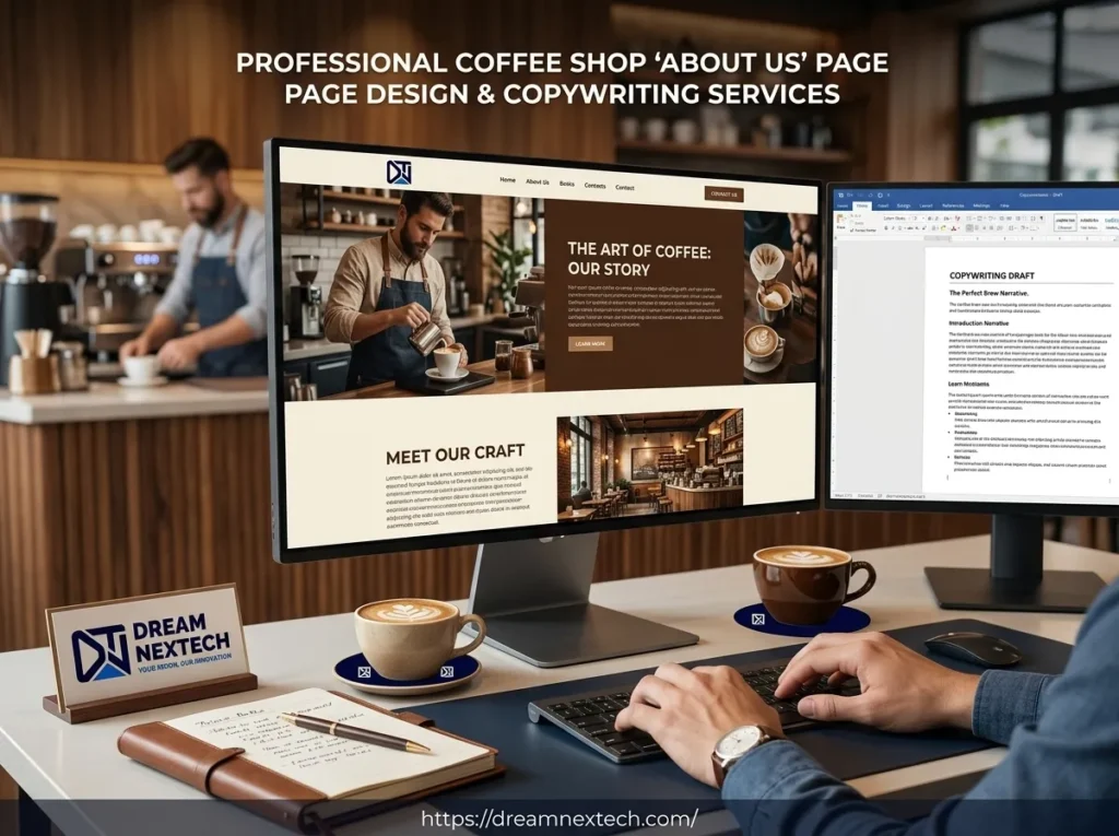
Portrait and story, side by side. A photograph of the owner or team on one side, three or four short paragraphs on the other. Image first on mobile. The simplest and most effective layout — the photograph carries the emotional weight and the copy just has to stay out of its way.
Timeline. Four to six vertical entries. Opened with one machine and four tables. Started roasting. Second location. Works beautifully for shops with genuine history, and badly for shops that opened last year, where the milestones feel padded. We’ll tell you which you are.
Full-bleed image with story blocks. A wide interior photograph, then two or three text blocks broken by smaller images. Editorial feel, suits shops with strong photography. Sourcing and grading are covered in our backgrounds and images guide.
Three-column values. Sourcing, roasting, community, with a small image each. We use this carefully, because it’s the layout most likely to slide into corporate filler. It only earns its place when each column holds a concrete fact. “We buy from two farms in Huila and visit annually” works. “We’re committed to quality” does not.
The Copy We Write
Opening lines that work:
We opened in a former launderette in 2020, which is why the floor is still tiled.
There are two of us. Amir roasts, Nadia runs the counter, and we’ve never had a manager.
This was supposed to be a bakery. The coffee took over within six months.
Opening lines that don’t:
Welcome to our coffee shop, where passion meets quality.
Our journey began with a simple dream.
The pattern is obvious once you see it. The good ones contain a fact only you could supply; the bad ones could be pasted onto any café website on earth.
Our standard structure: one paragraph on how it started with a concrete detail, one on what you actually do differently, one on who’s there with names and roles, and a closing line that invites people in with practical information. Three or four short paragraphs. Long about pages don’t get read.
If you’d rather write it yourself, we’ll interview you for twenty minutes and turn the transcript into something usable — most owners have the good material and just default to marketing language when they sit down to type.
Photography for This Page Specifically
The about page needs different images from the rest of the site. Your homepage wants atmosphere; this page wants people.
What we include: one clear photograph of the owner or team looking at the camera, one of work actually happening — hands on a portafilter, dough being shaped — and one of the space with real customers in it.
What we avoid: stock photos of strangers, which destroy trust faster on this page than anywhere else; empty-shop shots, because a café with nobody in it looks like a café nobody visits; and another overhead latte-art photo, which is already on every other page.
If you’re using stock imagery elsewhere, this is the one page worth an hour of a real photographer’s time, and we’ll say so.
Two Other Pages We Handle at the Same Time
Menu page. Categorised, scannable, prices right-aligned, no background image behind the text. It should be the fastest page on the site, because people open it while walking. We never link a PDF menu — they’re unreadable on phones and invisible to search engines. Plain text over flat colour beats a beautifully designed PDF every single time.
Login page. We only build one if you genuinely run a loyalty scheme with something behind it. An empty account area is worse than no account area. Where it’s justified, we keep it to email, password, and a clear route back to the main site.
How the Page Fits the Build
The about page sits between the menu and contact in the navigation, uses the same palette and type scale as everything else, and ends with a footer doing real work.
A few specifics we get right: no hero image with a headline overlay here — a simple heading on flat background reads better; one and a half screens of scrolling on desktop, maximum; and a link back to the menu, because the about page is the second-most-common exit point on café sites purely because it dead-ends.
Supporting decisions are covered in our guides to layout and wireframes, colour palettes, the homepage and hero section, and the footer. Visual direction across every style is on our coffee shop website design services page, with warmer treatments in our aesthetic designs guide.
Let’s Write Yours
If your about page currently says “passion for quality,” you’re leaving a genuine advantage unused. Independent cafés have the one thing chains can’t buy — a real story with real people in it — and most of them hide it behind marketing language.
Get in touch with DreamNexTech. We’ll review your existing page, tell you honestly what’s working, and quote for a rewrite or a full site build.
Copywriting and high-end web development are both in-house here, which means the words and the layout get designed together rather than one being poured into the other.