
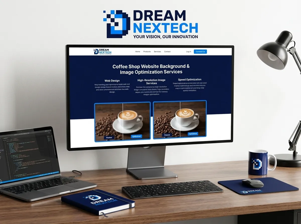
A café owner recently sent us their site to look at. Beautiful photography a photographer had shot the whole space properly. The homepage hero was 4.2MB. On a phone over 4G it took just under seven seconds to appear.
Every one of those photos was working against them. Google saw a slow site. Customers saw a white screen and left.
DreamNexTech designs Coffee Shop Website Background and Image Optimization Services that makes them viable — sourcing, grading, cropping, compressing, and serving them so a visually rich site still loads in under two seconds. Here’s how we approach it.
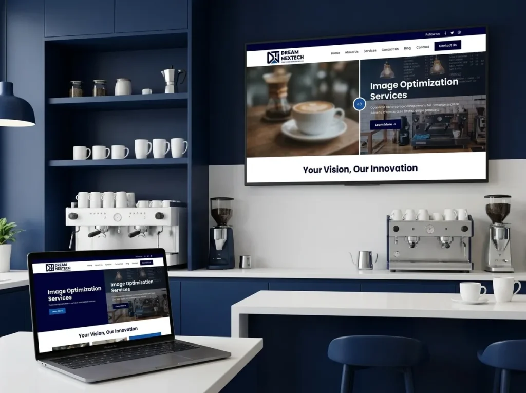
Coffee Shop Website Background and Image Optimization Services
look for Coffee Shop Website Background and Image Optimization Services below:
Three Types of Background, and When Each Belongs
Photographic. A real image of the shop, the coffee, or the street outside. Highest impact and highest risk — it works when the photography is genuinely good and consistently graded, and fails badly with generic stock.
Textural. A paper grain, linen weave, or subtle noise over flat colour. Adds warmth without competing with content. The safest option behind text.
Flat colour. A warm off-white or deep espresso tone. Loads instantly, never fights the content, and honestly carries most great café sites.
Most of our builds combine all three: photographic hero, flat colour body sections, textural accents. We decide per page rather than applying one treatment everywhere.
Sourcing Images When You Don’t Have a Photographer
Not every café has a shoot budget on day one. When yours doesn’t, we source from Unsplash, Pexels, Pixabay, Burst, and Kaboompics — all cleared for commercial use.
The trick is not using the images everyone else uses. The most-downloaded café photos appear on hundreds of websites. We search past the obvious terms — “café interior morning,” “window seat,” “hands on portafilter” — and go several pages deep, where the quality is identical and the recognition isn’t.
Then we make them not look like stock:
Grade warm and consistent. Highlights pulled toward amber, shadows lifted, contrast reduced slightly — and the same treatment on every image. Consistency is what separates a designed site from a collage.
Crop tighter than the original. Stock images are composed to be flexible, which makes them bland. Crop into a detail and it becomes specific.
Add subtle grain. Two to four percent noise gives digital images a printed quality that reads as deliberate.
The visual direction this supports is covered in our aesthetic coffee shop website designs.
Hero Background Techniques We Use
The hero is the highest-stakes image on the site. Four approaches that reliably work:
The scrim. A dark gradient over the image so white text stays legible:
background: linear-gradient(rgba(30,24,20,0.55), rgba(30,24,20,0.25)),
url(‘hero.webp’) center/cover;
This solves more hero problems than anything else. Without it, legibility depends on the specific photo — which means it breaks the day you change the photo.
Blur-behind-text. The image stays sharp, with a backdrop-filter blurring a small region behind the headline. More modern than a full overlay.
Duotone. The image mapped to two palette colours, guaranteeing it matches the site.
Split hero. Image on one half, flat colour with text on the other. No overlay needed and the most reliable background approach when photography is only adequate.
More on hero construction in our homepage and hero section guide.
Textural Backgrounds, Generated in CSS
Where possible we build textures in code rather than loading image files — zero extra requests, no impact on load time:
- Paper grain — an SVG noise filter at low opacity over flat colour
- Subtle gradient — a barely perceptible shift from #FAF6F0 to #F2EADF across a section
- Micro-pattern — a tiny tiled SVG of beans or steam at very low opacity, used sparingly
- Colour-block sections — alternating tones down the page to create rhythm
Tones come from the locked palette; our colour palette guide sets out twenty combinations we build with.
Coming-Soon Pages Before You Open
One of the most requested single-page builds is a coming-soon café page — a full-screen background at 1920×1080 with a mobile crop, the shop name, an opening date, and an email capture field.
It’s smart because you build an audience before you serve a single cup, and it costs almost nothing.
What we include:
- One full-bleed background image or gradient, correctly cropped for both landscape and portrait
- Logo and shop name
- One line: what you are and when you open
- Email capture connected to your mailing platform
- Instagram link
No navigation, no menu, no about section. The pastel green and cream combination is popular here for a reason — it reads as fresh and optimistic, which is exactly the tone a pre-opening page wants.
We build these in a few days and roll them into the full site later.
The Image Engineering Most Agencies Skip
This is where sites are won or lost, and it’s included in every build we do:
Modern formats. WebP at minimum, AVIF where supported, JPEG fallback. Typically 30–50% smaller at identical visual quality.
Correct sizing. Never a 2400px file served to a 390px phone. Every image gets a srcset with three or four sizes.
Aggressive compression. Quality 75–80 is visually identical to 100 on photography and roughly a third of the file size.
Lazy loading. Everything below the fold. Never the hero.
Hero preload. <link rel=”preload” as=”image”> so it starts downloading immediately.
Explicit dimensions. Width and height on every image to prevent layout shift, which Google measures directly.
Our targets: hero under 200KB, every other image under 100KB, Largest Contentful Paint under 2.5 seconds on a mid-range phone over 4G. We report the before-and-after numbers at handover.
Backgrounds by Page
Different pages want different treatments, and we specify each:
- Homepage — photographic hero, flat colour body
- Menu — flat colour only. Nothing competes with the drinks list.
- About — one photographic band, otherwise flat. See our about us page guide.
- Footer — a deeper palette tone. Details in our footer design guide.
- Gallery — flat neutral so the photography carries it
How these fit the overall structure is covered in our layout and wireframes guide, and finished examples across every style are on our coffee shop website design services page.
Let Us Handle the Images
If your site is slow, your photos are inconsistent, or you’re not sure what to use at all, this is a contained problem with a measurable result.
Get in touch with DreamNexTech. Send us your current site and we’ll run a free performance audit — actual load times, image weights, and what a rebuild or optimisation pass would change.
Image work sits inside our high-end web development service, and it’s routinely the single change that moves a café site from invisible to ranking.


Eye Care Clinic Website Design Fast Mobile HIPAA Ready - DreamNexTech
[…] Also check coffee shop website design. […]