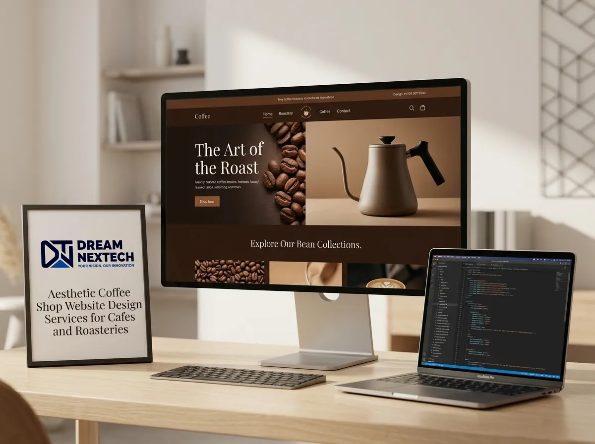
Nine out of ten café websites make the same mistake: they see “coffee” and reach for brown. Dark brown background, cream text, a splash of gold. It looks dated within a year and heavy from day one and it makes a warm, light-filled shop feel like a basement.
Colour is the first signal your website sends. Before anyone reads a word, the palette has already told them what kind of place this is.
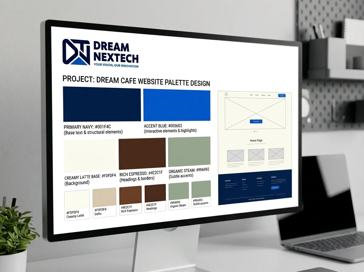
DreamNexTech builds custom Coffee Shop Website Color Palette Design chosen for your actual space, your actual photography, and your actual brand. Below are twenty combinations we work with, with hex codes, plus the rules that make them hold up in a real build.
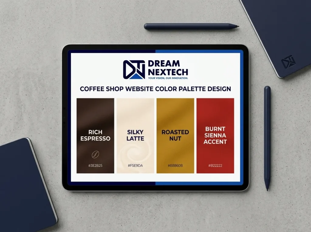
Coffee Shop Website Color Palette Design
The Rule That Fixes Most Café Palettes
Use a 60-30-10 split:
- 60% — a light, warm neutral background
- 30% — a mid-tone for sections and cards
- 10% — a saturated accent for buttons and links
Where café sites go wrong is inverting this and letting brown dominate. Keep the dark tones for text and small elements, let a warm off-white carry the page, and the whole site lifts.
Second rule: never pure white, never pure black. #FFFFFF is cold and #000000 is harsh. Warm both and everything improves at no cost.
Classic Warm Neutrals
1. Cream & Terracotta — #FAF6F0 · #E8DED1 · #C4643C · #2B2420 The modern default. Warm, grounded, works with almost any photography.
2. Oat & Espresso — #F5EFE6 · #D9CDBD · #4A342A · #1F1815 Understated. Good when your branding should stay quiet.
3. Linen & Rust — #F7F2EA · #DCCFC0 · #A85A3C · #332A24 More saturated than terracotta. Reads as handmade.
4. Bone & Caramel — #FBF8F3 · #E5D9C8 · #B8823E · #2A241E The lightest classic. Excellent for image-heavy layouts.
5. Sand & Clay — #F2EADF · #D6C4AE · #9E6B4F · #3A2E26 Earthy without being muddy.
Green Palettes
A green coffee shop website reads as calm and plant-filled. Sage has become the credible alternative to brown, and deservedly.
6. Cream & Sage — #FAF7F0 · #C9D1BE · #6B7A5C · #2E3428
7. Off-White & Forest — #F6F4EF · #DDE2D6 · #2F4A38 · #1A241D More serious. Suits roasteries and slow-coffee shops.
8. Pastel Green & Blush — #F4F7F1 · #CFE0CB · #E4B7AC · #3B4238 The palette behind nearly every coming-soon café page — fresh, optimistic, and highly shareable.
9. Olive & Oat — #F3EEE3 · #D5CBB6 · #7A7B4E · #2C2B20 Warmer than sage, handles yellow-toned photography well.
Dark Themes
A dark theme coffee shop website suggests evening trade or a serious roaster.
10. Charcoal & Amber — #1C1A18 · #2C2825 · #D99A4E · #F0EAE2 The strongest dark combination. Amber on near-black reads as lamplight.
11. Espresso & Cream — #221A15 · #33271F · #EFE3D2 · #C9A87C
12. Ink & Copper — #161719 · #26282B · #B87333 · #EDE9E3
13. Deep Green & Gold — #1B241E · #2A362D · #C9A227 · #EDEAE1
Dark builds demand real contrast discipline. Pure white on near-black causes eye strain — we use a warm off-white around #EDE9E3 for body copy and test every combination against WCAG ratios rather than eyeballing it.
Soft Pastels
14. Blush & Warm Grey — #FBF6F4 · #EBD9D3 · #B5827A · #3A3230
15. Butter & Cocoa — #FDF8EC · #F0E3C4 · #6B4B3A · #2E241D
16. Lilac & Cream — #F8F5F7 · #DFD5E0 · #7A6480 · #312B33 Unexpected in this niche, which is exactly why it stands out.
17. Peach & Sand — #FDF4EC · #F5DCC6 · #D08A5E · #3A2C22
Retro Palettes
18. Mustard & Brown — #F5EEDD · #E0C56E · #7A4A24 · #2B1F16
19. Burnt Orange & Cream — #FAF3E7 · #E8D5B7 · #D2601A · #33251A
20. Avocado & Oat — #F2EDDF · #D8CFB4 · #5F7043 · #2A2E1F
Matching Palette to Your Photography
This is where good palettes quietly fail. If your images are cool-toned — grey concrete, blue window light — a warm terracotta scheme looks mismatched no matter how good the hex codes are.
Our fix is to grade every image toward the accent colour: highlights pulled slightly warm, shadows lifted a touch, the same treatment applied to every photo on the site. Consistency across images matters more than any single photograph. Full detail in our backgrounds and images guide.
How We Implement Colour in the Build
We define palettes as CSS custom properties named by role rather than hue:
:root {
–bg-base: #FAF6F0;
–bg-raised: #E8DED1;
–accent: #C4643C;
–text-primary: #2B2420;
–text-muted: #6B5F56;
}
Naming a variable accent instead of terracotta means a future rebrand costs an afternoon rather than a rebuild.
We also test contrast before committing. Body text needs 4.5:1 against its background and large headings need 3:1. Terracotta on cream often fails for small text even though it looks fine on screen — so it goes on headings and buttons, and body copy stays in the darkest tone.
Where Colour Fits in Our Process
We choose the palette after wireframing and before photography. Applying colour to a greyscale layout immediately reveals whether the hierarchy actually works — the sequence is explained in our layout and wireframes guide.
Once locked, the palette drives the hero section, the footer, and the overall aesthetic direction. For restrained three-colour schemes, see our modern and minimal guide.
Get a Palette Built Into a Real Website
Picking hex codes is the easy part. Turning them into a consistent design system across every page with tested contrast, working dark mode, and hover states that don’t break is the work.
Talk to DreamNexTech about your café. Send us photos of your space and your current site, and we’ll propose a palette, show you how it applies across the build, and quote a fixed price.
High-end custom web development is our core service, and colour is where it starts because a palette chosen properly makes every decision after it easier. Full details on what a complete café build includes are on our coffee shop website design services page.