
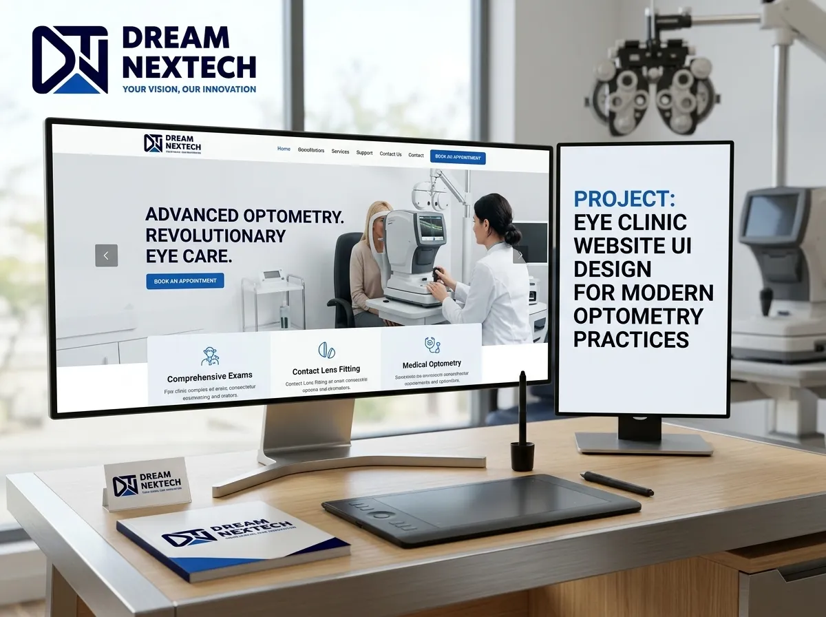
Your patients judge your clinical competence by your interface of Eye Clinic Website UI Design for Optometry Practices. It is unfair, it is unscientific, and it happens in under a second.
Researchers have measured it repeatedly: people form an aesthetic judgment about a website in roughly 50 milliseconds, and that judgment bleeds directly into how much they trust the organization behind it. For an optometry practice, that means a cluttered, dated, hard-to-navigate website is quietly telling prospective patients that your equipment is probably dated too.
Eye clinic website UI design for Optometry is not decoration. It is the visual language of trust — and modern practices are using it to out-book competitors who have better locations and longer histories.
Eye Clinic Website UI Design for Optometry Practices
UI vs. UX: Why Optometry Practices Need Both
Clinics often ask for a “redesign” when what they need is a rethink of the interaction.
UI (User Interface) is what the patient sees: typography, colour system, spacing, buttons, iconography, imagery, hierarchy.
UX (User Experience) is what the patient does: how quickly they find your dry eye page, how many taps until they reach the booking form, whether they understand which insurance you accept.
A gorgeous interface with a broken journey produces admiration and no appointments. A functional journey with an ugly interface produces distrust. Optometry practice web design has to solve both simultaneously, and that is precisely where template themes fail — they give you visual polish with no consideration of your actual patient flow.
The UI Principles That Move the Needle in Eye Care
1. Ruthless visual hierarchy. Every screen should have one obvious next action. On the homepage that is booking. On a service page it is booking. On the contact page it is booking. Secondary actions — call, directions, browse frames — get secondary visual weight. When everything shouts, nothing is heard.
2. Whitespace as a clinical signal. Dense, cramped layouts read as chaotic. Generous spacing reads as calm, organized, and precise — exactly the qualities a patient wants in someone examining their retina. Modern medical UI is defined more by what it removes than by what it adds.
3. A restrained, intentional colour system. Blues and teals dominate eye care for good reason — they signal clinical calm. But an entire site in soft blue produces zero conversion contrast. We build palettes with a deliberate accent reserved almost exclusively for calls to action, so the booking button never competes with the background.
4. Typography that respects the audience. A meaningful share of eye clinic visitors have compromised vision. Body text below 16px is a genuine accessibility failure in this niche. We design with 16–18px base sizes, generous line height, strong contrast ratios, and clear heading scales — better for patients, and better for accessibility compliance. Check out eye clinic website design and development.
5. Real photography. Nothing damages trust faster than a stock photo of a smiling model in a lab coat that appears on four other clinic sites in the same city. Real doctors, real staff, real exam rooms.
6. Micro-interactions with purpose. Subtle hover states, a form field that confirms valid input, a smooth scroll to the booking anchor. These small responses make an interface feel alive and reliable. Heavy animation, on the other hand, slows the site and irritates patients on older devices.
Mobile-First Is Not Negotiable
The majority of your prospective patients will meet your practice on a phone screen, often one-handed, often outdoors, often in a hurry.
A modern clinic website layout must therefore be designed on the small screen first and expanded upward. Practically, that means a sticky header with a persistent call and book button, thumb-friendly tap targets of at least 44 pixels, single-column content flow, forms with correct mobile input types so the keypad appears for phone numbers, and image sizes tuned for mobile bandwidth.
Our team applies this discipline on every project — you can see examples of that responsive web page design and editing work applied across a wide range of client sites.
Designing Interfaces for Anxious Patients
Eye care carries emotional weight. A patient searching for glaucoma management or sudden vision changes is often frightened. A parent booking a child’s first exam is uncertain. A person considering LASIK is excited but nervous.
Good UX design for eye clinics accounts for emotional state:
- Reassurance near the decision point. Place credentials, review counts, and “what to expect” content adjacent to booking buttons, not on a separate page.
- Plain language over clinical jargon. “Dry, gritty, tired eyes?” outperforms “Ocular surface disease management” as a headline every time. Use the clinical term for SEO in the body copy; lead with the symptom.
- Transparent expectations. How long is the appointment? Will pupils be dilated? Can they drive afterward? Answering these on the page removes hesitation before it becomes abandonment.
- Visible cost and coverage. Ambiguity about money is the single largest silent conversion killer in healthcare websites.
Interface Components Every Optometry Site Needs
A well-designed eye clinic interface is built from reusable, tested components:
- Sticky booking bar with call and schedule actions
- Service card grid with clear iconography
- Doctor profile cards with credentials and subspecialties
- Insurance logo strip
- Filterable frame and lens gallery
- Review carousel pulling live Google ratings
- Multi-location selector with map and hours
- Compact appointment form with minimal required fields
- Accessible FAQ accordion
- Patient resources and forms hub
Building these as a documented design system means every future page your team adds stays visually consistent — no drift, no chaos six months after launch.
Performance Is Part of the Interface
An interface that has not loaded does not exist. Beautiful UI delivered slowly is functionally identical to bad UI.
We treat performance as a design constraint: optimized asset delivery, lazy loading below the fold, restrained use of custom fonts, no bloated page builders, and clean semantic markup. The visual result stays premium; the technical result stays fast.
What a UI Redesign Actually Delivers
Practices that move from a generic template to a purpose-built interface typically see meaningful improvements in mobile bounce rate, average pages per session, and — the metric that matters — booking form completions. The site stops being a place people look at and becomes a place people act on.
You can review the range and quality of interface work our team produces in the full design and development portfolio.
Let’s Redesign the Experience, Not Just the Look
DreamNexTech designs eye clinic interfaces around one measurable goal: more booked appointments from the traffic you already have.
Our process is straightforward. We audit your current UI and identify friction. We map the real patient journey. We design a mobile-first interface with your brand, your doctors, and your services at the centre. We build it fast, clean, and accessible. Then we measure and refine.
Stop guessing why visitors leave. Book a free UI audit with DreamNexTech and we’ll show you — screen by screen — exactly where your optometry website is losing patients and what a modern interface would recover.



Professional Eye Clinic Website Design Services
[…] also check out eye clinic website UI Design. […]