

One image decides whether a visitor stays or leaves. Not your copy. Not your pricing. Not your brand story.
In home decor, the picture is the pitch. Your customer isn’t buying a lamp — she’s buying the feeling of that lamp in her hallway at dusk. If your imagery doesn’t sell that feeling in under three seconds, she’s gone, and she’s not coming back from a retargeting ad either.
So let’s talk about how to choose Home Decor Image for Your Website that actually move product — and the technical details most store owners get wrong.
Hire Our Professional Services

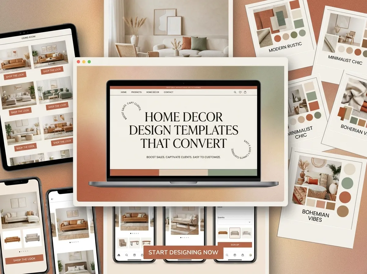
Home Decor Image for Your Website
First, Decide What Job the Image Has to Do
Every image on a home decor site is doing one of four jobs. Confusing them is the root of most bad choices.
1. The hero image — sets the mood. This is your home decor hero image, and its only job is emotional. It should communicate style, price tier, and season in one glance. No clutter, no five products competing, no text stamped over the focal point.
2. The category or banner image — orients. A home decor banner image for “Lighting” should be unmistakably about lighting. Recognition beats artistry here.
3. The product image — informs. White background, true color, correct scale, multiple angles. This image answers questions, it doesn’t create atmosphere.
4. The lifestyle image — persuades. Product styled in a believable room, with context that helps the buyer imagine ownership.
Get these mixed up — a moody lifestyle shot used as a product image, say — and your conversion rate drops while your return rate climbs. Check out home decor website design service.
The Five Rules for Choosing a Home Decor Hero Image
Rule 1: One focal point, off-center
The eye needs somewhere to land. A hero with a single clear subject placed on the left or right third leaves clean negative space for your headline and CTA. Centered, symmetrical shots look nice standalone and fall apart the moment you add text.
Rule 2: Match the light to your price point
Warm, low, directional light reads as premium and intimate. Bright, even, daylight-flooded rooms read as accessible and cheerful. Neither is better — but a discount homeware brand using dim luxury lighting confuses shoppers, and a luxury brand using flat catalog light destroys its own margin story.
Rule 3: Include a human element, sparingly
Hands adjusting a cushion. A half-finished cup of coffee. A throw draped imperfectly. These small signs of life outperform sterile styled sets consistently. Full faces, though, pull attention away from the product.
Rule 4: Respect the mobile crop
Your gorgeous 16:9 hero becomes a narrow slice on a phone. Before committing to an image, crop it to 4:5 and 1:1 and check the subject still survives. If it doesn’t, you’ll need art direction for separate mobile and desktop versions — which is standard practice, not an inconvenience.
Rule 5: Keep the palette to three colors
Home decor imagery with a tight palette makes your whole site look intentional. Pull your site’s accent color from your hero image rather than the other way around, and the design will feel cohesive without any extra effort.
Stock Photos vs. Custom Photography
Straight answer: stock photography is fine for blog posts, editorial banners, and inspiration content. It is not fine for product pages.
The problem with stock in home decor is specificity. Your customer will notice that the vase in your hero isn’t a vase you sell. That mismatch reads as inauthentic, and inauthenticity is expensive in a trust-driven category.
A practical middle path many of our clients use:
- Custom: all product shots, your top 10 bestsellers styled in-room, homepage hero
- Stock: blog imagery, seasonal campaign banners, room-inspiration collages
- User-generated: review sections and social proof blocks — often your highest-converting imagery of all
Even a single-day shoot with a decent camera and window light will outperform premium stock, because it’s yours.
Hire Our Professional Services
The Technical Side: Where Beautiful Images Kill Conversions
This is where most home decor websites lose money silently. A stunning 4MB hero image that takes six seconds to appear has already lost the customer it was meant to impress.
Here’s the checklist we apply to every build:
- Format: serve WebP or AVIF with a JPEG fallback. Expect 30–50% smaller files at identical visual quality.
- Dimensions: never upload an image wider than it will ever display. 2000px is plenty for a full-width hero; 1200px for product images with zoom.
- File size targets: hero under 200KB, product images under 120KB, thumbnails under 40KB.
- Responsive delivery: use
srcsetandsizesso phones download phone-sized files, not desktop ones. - Lazy loading: everything below the fold gets
loading="lazy". Your hero does not — it should be preloaded. - Aspect ratio locked in CSS: prevents layout shift, protects your Core Web Vitals score.
- Descriptive file names:
matte-black-arc-floor-lamp.webp, notIMG_4471.jpg. - Real alt text: describe the product and context — “matte black arc floor lamp beside a linen sofa.” This serves screen readers and earns you Google Images traffic, which is significant in the decor niche.
Image search is an underrated acquisition channel here. People search visually for interiors constantly. Well-named, well-tagged, fast-loading images turn that into free traffic.
If your current site is loading slowly because of oversized imagery and unoptimized markup, that’s a fixable front-end problem — and it’s exactly the kind of work our front-end web development service handles, usually inside a few days.
A Quick Test Before You Publish
Before any image goes live, run it through these four questions:
- Squint test: blur your eyes. Is the subject still obvious?
- Phone test: open it on your actual phone in daylight. Still readable? Still fast?
- Price test: would a stranger guess your correct price range from this image alone?
- Swap test: could a competitor use this exact image? If yes, it isn’t doing brand work.
Anything failing two or more gets replaced.
Your Imagery Is Your Storefront Window
You wouldn’t put a blurry, cluttered display in a physical shop window and expect foot traffic. Your website’s images are that window — and they’re working every hour of every day, for every visitor, whether or not you’ve optimized them.
Choose them with intent. Compress them properly. Name them thoughtfully. Then let them do the selling.
Need it done right the first time, with the layout, art direction, and technical optimization handled together? That’s what we do at DreamNexTech.




Furniture And Home Decor Website Design: Best Practices - DreamNexTech
[…] For luxury furniture website design, deep charcoal or muted olive backgrounds with cream type can work beautifully — but they demand exceptional photography. Dark themes amplify every flaw in your images. also check about home decor image for your website. […]