
You get between two and five seconds. That’s the window in which someone who found your café website decides whether to visit you or close the tab.
Most café heroes waste it entirely — a beautiful photo of latte art, the shop name in a script font, and a button that says “Explore.” Lovely to look at, and it answers none of the three questions a stranger actually has: what is this place, where is it, and should I go?
DreamNexTech designs and builds Coffee Shop Homepage and Hero Section Design around those three questions. Here’s the structure we use, why it works, and what a build with us includes.
The Four Elements of a Hero That Works
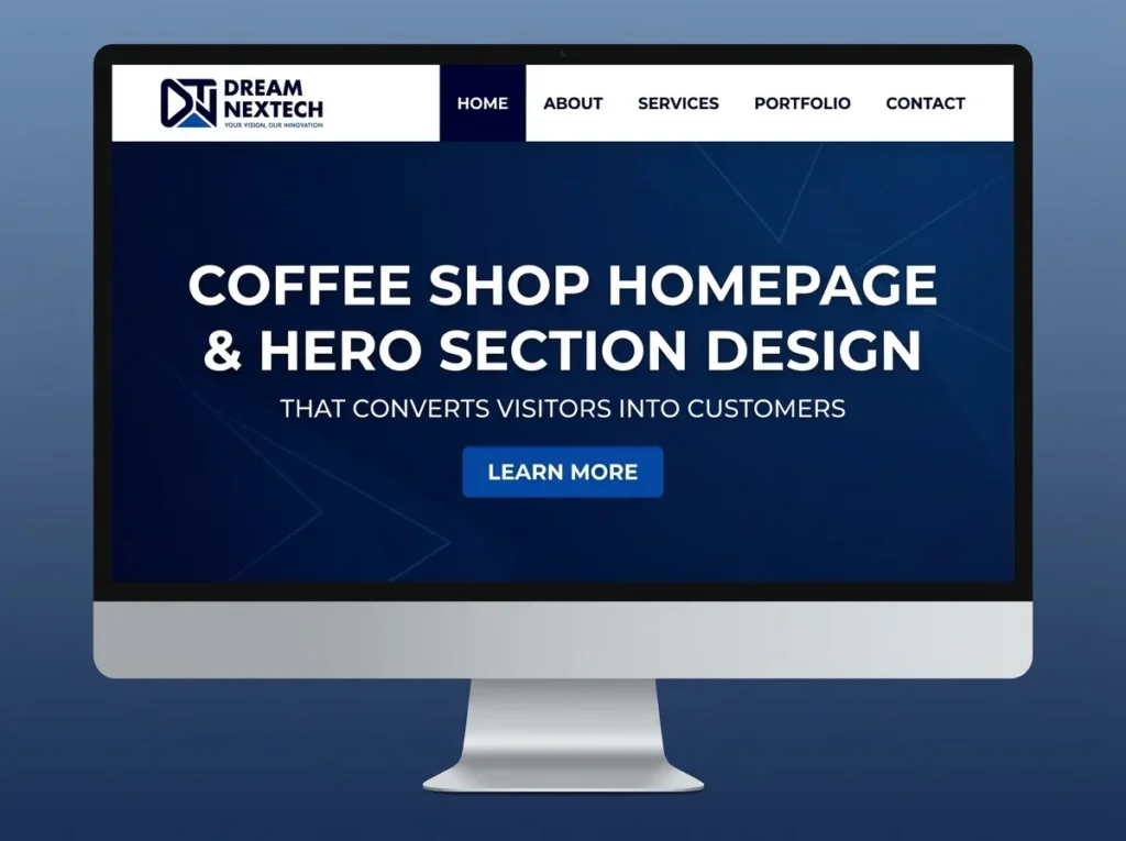
Every coffee shop website hero section we build contains exactly four things.
A background that sets the mood. One image, one gradient, or one flat colour. Never a slideshow — nobody sees slide three, and it slows the page down.
A headline that says what you are. Not a slogan. “Speciality coffee and pastries in Camden” outperforms “Where every cup tells a story” every time. Slogans feel like marketing; descriptions feel like information, and information is what people came for.
One supporting line. Hours, neighbourhood, or your single distinguishing detail. “Open 7am–4pm, seven days” does more work than another sentence about passion.
One primary button. One. View Menu, Order Online, or Get Directions — whichever action matters most for your shop. Two buttons split attention; three mean the decision hasn’t been made.
That’s a complete hero. Everything added beyond it subtracts from clarity, and we’ll tell you that during design rather than after launch.
The Essentials Strip
Directly beneath the hero we place a thin band carrying your address, today’s opening hours, and a tappable phone number.
This is the highest-value fifty pixels on any café website, and most sites don’t have it. People arriving on your homepage overwhelmingly want to know whether you’re open and how far away you are. Answering that instantly — rather than sending them hunting for a contact page — is the difference between a visit and a bounce.
On mobile it shows today’s hours specifically: “Open until 4pm today,” not a seven-row table.
Hero Layouts We Build
Full-bleed image with scrim. The image fills the viewport under a dark gradient, text centred on top. The most common café header pattern and still the most effective when the photography is strong. We always use the scrim — without it, legibility depends on the specific photo, which means it breaks the day you swap it.
Split-screen. Image on one half, flat colour with text on the other. Guaranteed legibility, no overlay, stacks cleanly on mobile. The right call when photography is decent rather than exceptional.
Type-led. No hero image at all — large typography on flat warm colour. Loads almost instantly, looks confident, and sidesteps the photography problem entirely. Works when your name and palette are distinctive.
Video background. Short, silent, looping footage of steam or a pour. Beautiful and expensive in performance terms. We keep it under 3MB, always provide a poster image, and disable it on mobile.
Offset card. Full-bleed image with a solid text card overlapping its lower third. Editorial feel, neat legibility solution.
Finished examples across every style are on our coffee shop website design services page.
Writing the Headline
We write these with clients rather than for them, using four rules:
Name the category and the place. “Neighbourhood coffee bar in Shoreditch.” Immediately orienting.
Under nine words. Anything longer becomes a paragraph nobody reads at 48px.
No coffee clichés. “Life begins after coffee.” “But first, coffee.” These signal a template, not a shop.
Lead with the specific thing. If you roast on site, that’s the headline. If you’re the only place open before 7am, that’s the headline. Specificity is the entire game.
Mobile Hero Design
Most people meeting your homepage are outside on a phone deciding whether to walk two more minutes. So the mobile hero is the primary design and desktop is the variation.
- Hero height around 70vh, not full screen. Leaving a slice of the next section visible tells people there’s more.
- A dedicated mobile crop via srcset — a wide landscape hero crops badly to portrait, and the subject needs to survive at 390px.
- Type scaled with clamp() rather than breakpoint jumps. A 64px desktop headline becomes roughly 32px.
- A sticky bottom bar with Order and Directions buttons. Unglamorous, and it consistently outperforms everything else we test.
- Tap targets at 44px minimum.
Motion We Include, and Motion We Refuse
Worth having: a slow fade-and-rise on the headline at 600–800ms, a gentle steam loop on an illustrated cup, subtle hero parallax used once, and buttons that warm on hover.
Not worth having: auto-advancing carousels, full-screen loading animations, letter-by-letter typing effects, and scroll-jacking of any kind.
We respect prefers-reduced-motion on everything, and no animation is ever allowed to delay first paint.
Performance in the Hero
Your hero determines Largest Contentful Paint, which affects both search ranking and whether anyone waits. Every build we deliver includes:
- Hero image preloaded and served in WebP or AVIF, under 200KB
- Critical CSS inlined for above-the-fold content
- Explicit width and height to eliminate layout shift
- Fonts subset and preloaded so text doesn’t reflow
- LCP under 2.5 seconds on a mid-range phone over 4G, verified and reported
What Comes Below the Hero
The hero opens; the rest of the homepage has to follow through. Our standard structure runs: essentials strip, menu preview, short story block linking to the about us page, location and map, then a footer built for local SEO.
That’s a complete café homepage. Adding a testimonials carousel, an Instagram feed, and a newsletter popup on top of it is how good homepages become slow ones — and we’ll push back when a request will cost more in speed than it returns in value.
Get a Homepage That Actually Brings People In
If your current homepage is beautiful and quiet, the problem is usually structural rather than visual — and it’s fixable in weeks, not months.
Book a free homepage review with DreamNexTech. Send us your URL and we’ll come back with your real mobile load time, what your hero is failing to communicate, and a fixed quote for a rebuild.
Supporting decisions are covered in our guides to layout and wireframes, colour palettes, background imagery, and minimal design.
High-end custom development is our core service. On a café site, the hero is where it pays for itself fastest.

Eye Clinic Website UI Design That Turns Visitors Into Patients
[…] also check coffee shop website design. […]