
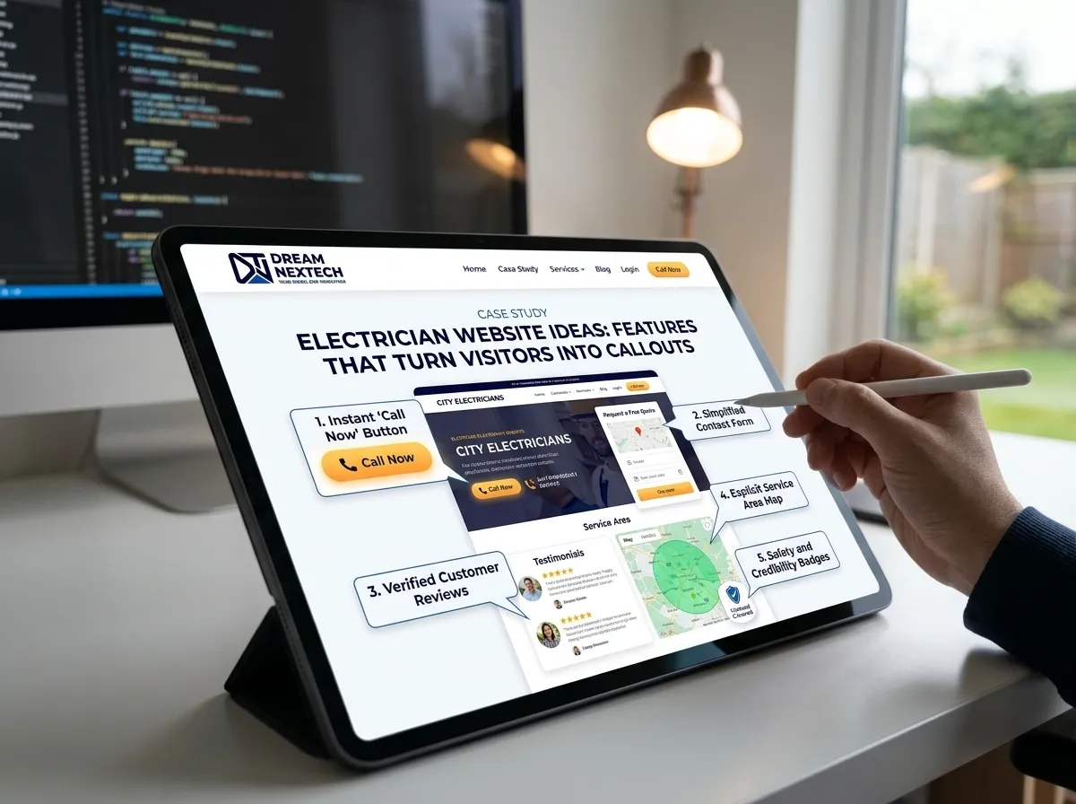
Most electrician website ideas you’ll find online are about looks. A nicer hero image. A better colour scheme. An animated statistics counter showing how many jobs you’ve completed.
None of those has ever made a phone ring.
The features that actually produce callouts are less exciting and considerably more effective. Here are the ones we build into every electrician website at DreamNexTech, ranked roughly by what they return.
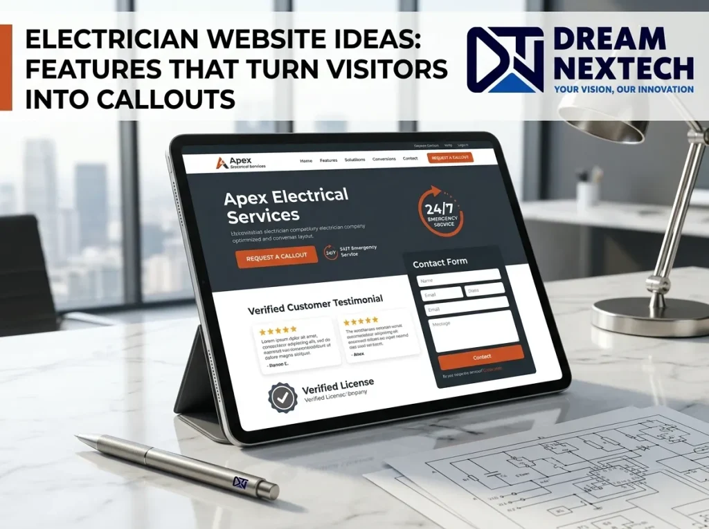
Electrician Website Ideas Features That Turn Visitors Into Callouts
Check out Electrician Website Ideas Features That Turn Visitors Into Callouts below:
The Sticky Mobile Call Bar
A bar fixed to the bottom of the screen on mobile with two buttons: Call Now and Get a Quote. Present on every page, always visible, never requiring a scroll.
This is the highest-converting element we implement on trade websites, and it’s not close. It takes an afternoon to build.
Most electrician traffic is mobile, and most of it arrives mid-problem. Removing every barrier between “this looks right” and “phone ringing” is the whole job.
A Tappable Number in the Header — On Every Page
Obvious, and routinely missed. We find phone numbers typed as plain text, or set inside images, on a startling number of live sites.
It needs to be a tel: link, it needs to be in the header rather than only the footer, and it needs to be on every page — not just the homepage, because most visitors from search land somewhere else.
also check emergency electrician website design.
A Postcode Coverage Checker
One field: “Enter your postcode to check we cover you.”
This answers the question that stops a large share of visitors dead. Someone two towns over genuinely cannot tell from your homepage whether you’ll travel, so they assume not and call someone else.
It also captures useful data — postcodes you’re getting searched from but don’t yet cover.
A Four-Field Quote Form
Name, phone, postcode, brief description of the problem. That’s it.
Every additional field measurably reduces submissions. You do not need their email address, preferred contact time, how they heard about you, or a dropdown of service types. Ask on the phone.
Fifteen seconds to complete is the target.
Pricing Guidance Without a Price List
You don’t have to publish fixed prices. But a range with the factors that move it — “most EICRs run £150–£250 depending on circuit count and property size” — does two things: it filters out people looking for £40, and it reassures serious enquirers that you’re not going to invent a number when you see their driveway.
Pages carrying pricing guidance convert consistently better than pages that don’t. This is one of the few electrician website ideas that most firms resist and almost all benefit from.
Verifiable Trust Signals
Not logos — logos are graphics anyone can download.
Your actual registration number. NICEIC, NAPIT, whichever body. A number can be checked.
Insurance level stated plainly. “£5m public liability cover.”
Years trading. “Working across Leeds since 2011.”
Live review count linked to the profile. “4.9 from 187 Google reviews,” clickable.
Placed above the fold, not on a separate about page nobody visits.
Before-and-After Job Photos
An old rewireable fuse box beside the new consumer unit. A messy junction rectified. A completed EV charger install.
Phone photos are fine — better than fine. They’re more convincing than professional stock imagery precisely because they look like your work rather than someone else’s marketing.
A gallery of twenty real jobs does more for trust than any amount of copy about your commitment to quality.
A “What Happens Next” Section
Three or four lines: you call, we arrive within two hours, we diagnose and quote before starting any work, you get a certificate on completion.
This removes the specific anxiety of letting an unknown tradesperson into your home — the not knowing how it will go. It costs one small section and it converts unusually well.
An Emergency Banner
A thin bar above the header: “24/7 emergency callouts — 0117 000 0000.”
After hours, this turns your entire website into an emergency landing page without building one. Emergency searches convert far harder than routine ones, and they happen when your competitors’ offices are shut. Our guide to emergency electrician website design goes further into building for that traffic specifically.
Individual Service Pages
Structural rather than a feature, and it’s the biggest single change most electrician sites need.
One page each for rewires, fuse board replacement, EICR certificates, EV charger installation, fault finding, and outdoor lighting. A bullet list on the homepage cannot rank for six different searches; six pages can.
Service Area Pages
Same logic applied to geography. One page per town you cover, each with genuine local content rather than the same paragraph with the place name swapped.
If you cover eight towns and have one contact page, you’re invisible in seven of them.
A Recent Jobs Feed
Three or four recent installations with the town named and a photo. Updated monthly by whoever’s in the office.
It doubles as proof and as local SEO content, and it signals that the business is active — which a static site never does.
Speed as a Feature
Not a feature customers see, and the one that costs you most when it’s missing.
A site that takes five seconds on mobile has lost roughly half its visitors before appearing. We build to under 2.5 seconds on a mid-range phone over 4G — hand-coded semantic HTML, images in WebP and AVIF with correct srcset, fonts subset and preloaded, no page-builder overhead.
We’ve seen sites drop from six seconds to under two and roughly double their enquiries with no other change.
What We’d Skip
Worth saying plainly, because these appear on most electrician website template demos:
Homepage sliders. Nobody sees slide three. They slow the page significantly.
Animated statistics counters. Impress nobody, delay the call button.
Full-screen hero video. Expensive in load time, and it’s usually stock footage of sparks.
Live chat widgets. Unless someone is actually monitoring them. An unanswered chat is worse than none.
Long about pages. Two paragraphs and a team photo. Nobody is reading your company history.
Every one of these costs load time, and load time costs calls.
Build the Ones That Pay
Most of the features above take days rather than weeks, and several can be added to an existing site without a full rebuild.
Ask DreamNexTech for a free review. Send us your URL and we’ll tell you which of these you’re missing, what it’s likely costing you, and a fixed quote to fix it.
If you already have a design or mockups ready, we also build finished designs into fast responsive pages, and examples of our work are in our development portfolio.
Website design and development is one of the services we run alongside SEO and digital marketing — and for electricians, it’s the one that shows up as a phone ringing more often.
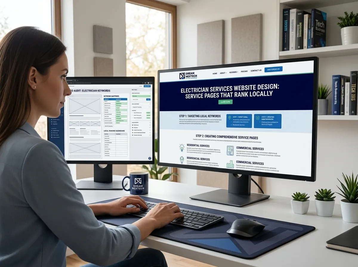



Electrician Services Website Design Service Pages That Rank Locally
[…] also check electrician website design ideas. […]