
It’s 2am. Half a house has lost power, there’s a burning smell near the consumer unit, and someone is standing in a dark hallway typing “Emergency Electrician Website Design near me” into a phone with one hand.
They will open two or three results. They will spend maybe fifteen seconds on each. They are not reading your about page.
Whoever makes calling easiest gets the job — at emergency rates, with no price negotiation. That’s the highest-value traffic in the trade, and most electrician websites are built as though it doesn’t exist.
DreamNexTech builds sites for that moment specifically. Here’s what changes.
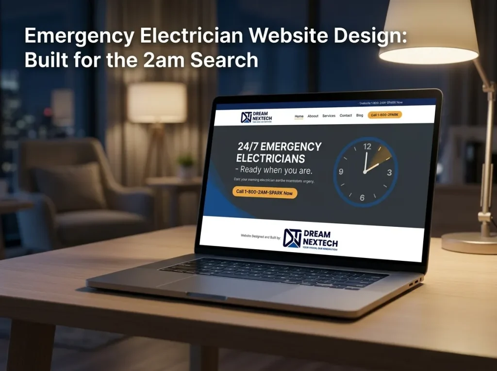
Emergency Electrician Website Design
It converts at a far higher rate. Someone searching for a rewire quote is comparison shopping across a week. Someone searching at 2am is calling in the next ninety seconds.
Price sensitivity drops to almost nothing. Emergency callout rates are accepted without argument when the alternative is a night without power.
Competition is thinner. Many local firms have websites that assume office hours, no emergency messaging, and a contact form as the main route in. Forms are useless at 2am.
It leads to more work. An emergency callout frequently becomes a fuse board replacement or a partial rewire the following week.
If even ten percent of your traffic arrives with emergency intent, designing for it is the highest-return decision on the site.
The Rules for a 2am Page
Everything below exists to remove seconds and friction.
A call button visible without scrolling. Not below a hero image. Not below trust badges. The first interactive element on the page.
A sticky call bar fixed to the bottom of the screen. Present on every page, permanently visible. This is the single highest-converting element on any trade site we build.
Availability stated as a fact. “Answering calls now — 24/7 emergency electricians, Leeds.” If you can, show a live status: available, or next available at 7am. Certainty is what someone in the dark wants.
A response time. “Typically on site within 90 minutes.” This one line does more than any amount of copy about your experience.
Dark-friendly design. They’re on a phone at full brightness in a dark hallway. High contrast, no glaring white expanses, large legible type. Practical, not decorative.
Loads in under two seconds. On patchy signal, in a basement, on a three-year-old phone. Every second here is a lost job.
No forms above the fold. Nobody fills in a form during an emergency. The form can exist further down for non-urgent enquiries. Also check eye clinic design website.
A Dedicated Emergency Page
Two approaches work, and which you need depends on volume.
An emergency banner sitewide. A thin bar above the header carrying “24/7 emergency callouts” and a tappable number. Every page becomes a viable emergency landing page. Quick to add, and the right first step for most firms.
A dedicated emergency landing page. For firms where emergency work is a real revenue line. Stripped back to almost nothing: availability, phone number, response time, coverage area, and a short list of what counts as an emergency. No navigation clutter, no story, no gallery.
We usually build both — the banner for people arriving on any page, the dedicated page as the target for emergency-intent searches.
Ranking for Emergency Searches
Design handles the conversion. Getting found is the other half.
Build a page per emergency term and area. “Emergency electrician Leeds,” “24 hour electrician Wakefield.” One page each, with genuine local content.
Name the fault types people actually search. Power cut, tripping RCD, burning smell from the fuse box, sparking socket, no hot water, half the house without power. These are the phrases typed at 2am, and most electrician websites contain none of them.
Add opening hours schema showing 24/7 availability. This can surface directly in search results, and it’s a genuine differentiator against competitors marked as closed.
Keep your Google Business Profile aligned. Hours set to 24 hours, emergency service listed, name and phone formatted identically to your website.
Load speed as a ranking factor. Google weights mobile speed directly, and emergency searches are almost entirely mobile.
The broader structure this sits inside — service pages, area pages, and how they interlink — is covered in our guide to electrician service pages that rank locally.
What Not to Put on an Emergency Page
Your company history. Nobody cares at 2am.
A hero slider. Nobody sees slide two, and it delays the call button.
A long list of every service you offer. They have one problem.
A contact form as the primary action. It will not be used.
Video. Expensive in load time, useless in an emergency.
A cookie banner covering the call button. We see this constantly. Check it on a real phone.
The Technical Standard
Emergency pages are where build quality is most visible, because they’re accessed in the worst conditions:
- Largest Contentful Paint under 2 seconds on a mid-range phone over 4G
- Hand-coded semantic HTML with minimal JavaScript
- Images in WebP and AVIF, sized per viewport — or, on a dedicated emergency page, almost no images at all
- Fonts subset and preloaded, or system fonts on the emergency page for instant render
- 44px minimum tap targets, tested with one thumb
- Responsive from 320px upward, tested on real devices
Examples of our build quality are in our development portfolio.
Test It Properly
Before launch, we run a specific check, and you should too.
Take a phone. Turn the lights off. Load the site over mobile data rather than wifi. Time how long until you can tap the number.
If it’s more than three seconds, or if you have to scroll, or if a cookie banner is in the way — that’s a lost job, repeated every night.
Set It Up
Most of this is a few days of work, and much of it can be added to an existing site without a rebuild — a sitewide emergency banner, a sticky call bar, a dedicated landing page, and the schema to support it.
Ask DreamNexTech for an emergency readiness review. Send us your URL and we’ll test your site the way a customer would at 2am, then come back with what’s blocking calls and a fixed quote to fix it.
If you already have designs prepared, we also convert finished designs into fast, production-ready HTML5.
Web design and development runs alongside the SEO and digital marketing services we offer. Emergency traffic is where they overlap most usefully — being found and being callable are the same problem at 2am.

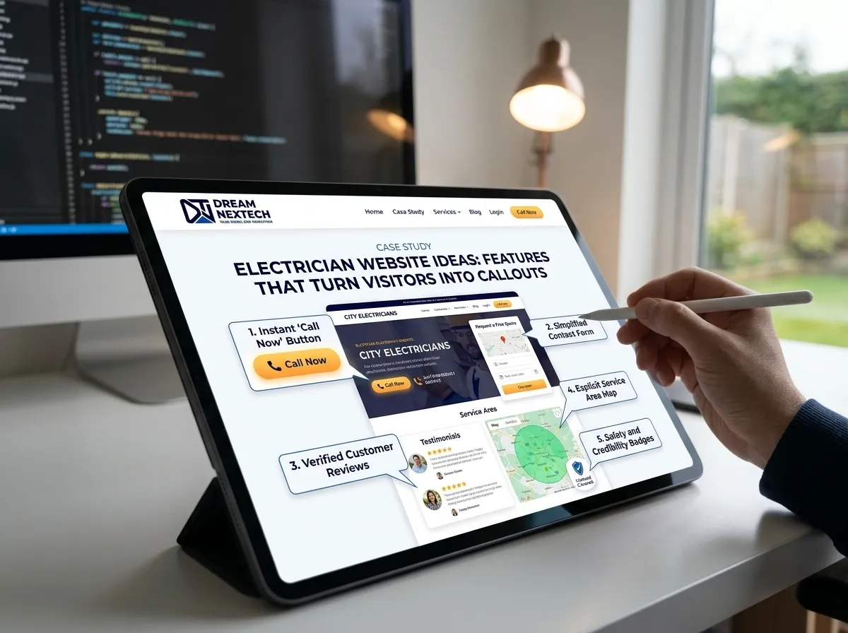


Electrician Website Ideas Features That Turn Visitors Into Callouts - DreamNexTech
[…] also check emergency electrician website design. […]