
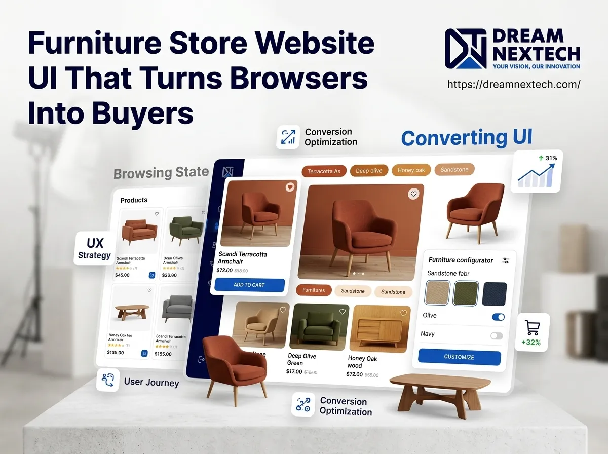
Ninety-four percent of first impressions about your Furniture Store Website UI That Turns Browsers Into Buyers as visitor reads your product description. If your furniture store website UI makes someone squint, scroll aimlessly, or hunt for a price, they are gone. They are on a competitor’s site looking at the same walnut dining table, with a cleaner layout and a faster “Add to Cart” button.
That is the entire problem. Furniture is a high-consideration, high-ticket purchase. Nobody spends $2,400 on a sectional because your homepage had a nice hero image. They spend it because your interface removed every reason to hesitate.
Hire Our Professional Services
Why Most Furniture Websites Leak Revenue
Walk through ten furniture retail websites and you will see the same four mistakes repeated like a bad habit:
Images that hide the product. Lifestyle photography is beautiful, but if a shopper cannot see the sofa’s back panel, leg finish, or fabric weave at 200% zoom, they will not buy. Furniture ecommerce UI lives or dies on visual confidence.
Filters that do not match how people shop. Customers search by room, by size, by material, by delivery window. Most furniture store website designs offer “Price: Low to High” and call it a day.
Hidden pricing and delivery details. Every unanswered question is a bounce waiting to happen. “Contact for price” is the fastest way to lose a ready buyer.
Mobile layouts that were an afterthought. More than 60% of furniture browsing starts on a phone. If your product grid collapses into a single unusable column, your mobile conversion rate will reflect it.
A professional furniture store website design fixes all four at the interface level — not with more ad spend.
Furniture Store Website UI That Turns Browsers Into Buyers
1. A Hero Section With a Job to Do
Your homepage hero is not decoration. It has one task: Furniture Store Website UI That Turns Browsers Into Buyers. That means a clear category entry point (“Living Room,” “Bedroom,” “Dining”), a visible promise (free delivery, 0% financing, in-stock now), and a single dominant call to action. Rotating carousels dilute this. Static, decisive heroes outperform them almost every time.
2. Product Cards Built for Comparison
Furniture buyers comparison-shop obsessively. Your product cards should carry: primary image, hover-swap alternate angle, price, key dimension, material, available finishes as small swatches, and stock status. That is six pieces of information in a card the shopper reads in under two seconds. Get this right and your category pages start doing the selling for you.
3. Filters That Mirror Real Buying Criteria
Great furniture ecommerce website design lets people filter by seat width, depth, material, colour family, delivery lead time, and room type. Faceted navigation with instant results — no page reloads — keeps the shopper in flow. Every filter you add that matches a real decision criterion shortens the path to purchase.
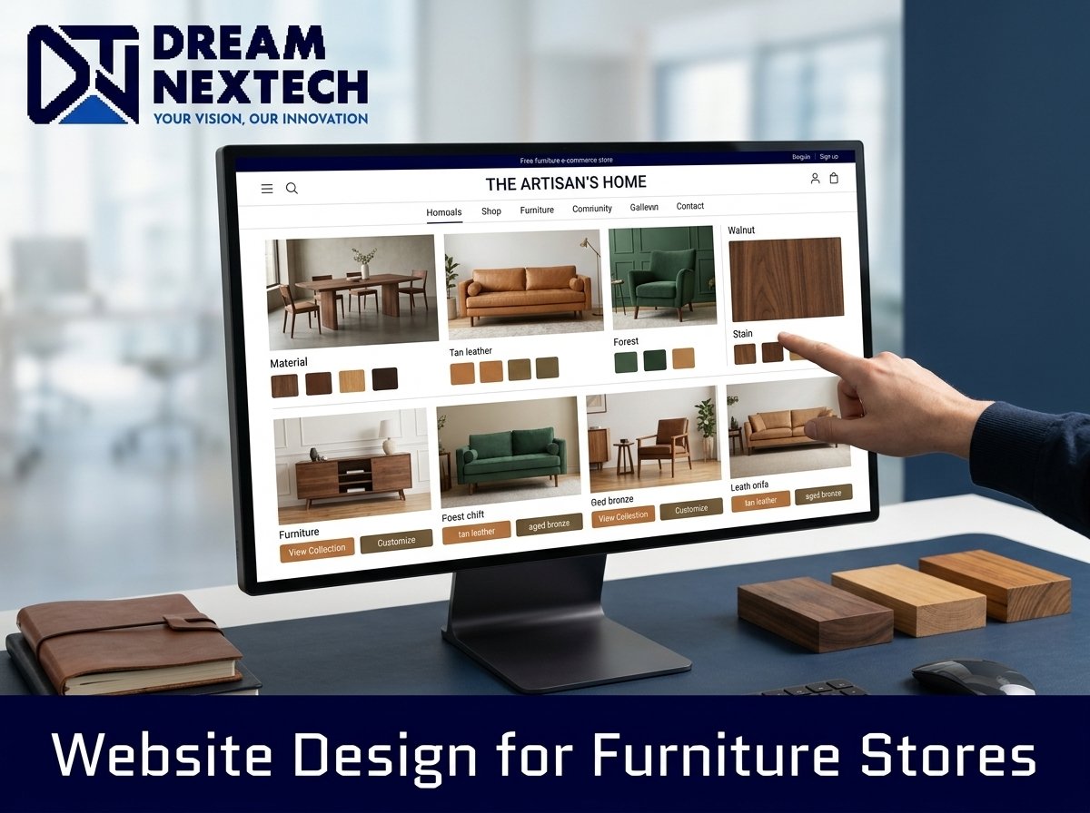
4. Visual Configurators and Swatch Systems
If you sell configurable pieces, let people see the change instantly. Fabric swatches, wood finishes, and modular layout builders convert because they replace imagination with certainty. This is where a skilled front-end build matters — smooth, fast interaction states are the difference between a delightful configurator and a frustrating one. If you need that level of interface engineering, our team handles it directly through our front-end web development service.
5. Trust Signals Placed Where Doubt Appears
Doubt shows up at three points: the product page, the cart, and the checkout. Place your warranty badge, return window, delivery guarantee, and financing options at exactly those three points. Not in the footer. Not on an “About” page nobody visits.
Hire Our Professional Services
Speed Is a UI Feature
Furniture sites are image-heavy by nature. A single unoptimised hero image can add three seconds to your load time, and every extra second past the two-second mark costs you conversions. The fix is technical but non-negotiable:
- Serve WebP or AVIF with responsive
srcsetsizing - Lazy-load below-the-fold imagery
- Preload the hero image and critical fonts
- Keep third-party scripts to the ones that actually earn their weight
- Target Core Web Vitals in the green: LCP under 2.5s, CLS under 0.1
A gorgeous furniture store website UI that loads in six seconds is not a gorgeous website. It is an expensive brochure nobody reads. also check furniture website design services.
Product Pages: Where the Sale Is Won
The product detail page is the single highest-leverage screen in furniture ecommerce store website development. Structure it in this order:
- Gallery first — minimum six images, including scale reference, detail shot, and a room context photo
- Price and finance options together — “$1,890 or $63/mo” outperforms price alone on high-ticket items
- Dimensions in a diagram, not a paragraph
- Delivery estimate by postcode, calculated live
- Materials and care, written plainly
- Reviews with photos — user-generated imagery is the strongest proof you own
- A sticky add-to-cart bar on mobile that never scrolls out of reach
Add a “Book a Showroom Visit” option for stores with physical locations. Plenty of furniture customers want to sit on the sofa before they commit, and giving them that path captures a sale you would otherwise lose entirely.
Checkout: Remove Steps, Not Information
High-ticket checkout abandonment usually comes from surprise, not price. Show delivery cost before the final step. Offer guest checkout. Reduce the form to the fields you genuinely need. Display accepted payment methods and financing partners early. A three-step checkout with a visible progress indicator consistently outperforms a single overwhelming page.
What This Looks Like Implemented
The businesses that win in online furniture retail are not the ones with the biggest catalogues. They are the ones whose interfaces answer questions before customers think to ask them. Every scroll has a purpose. Every click moves the shopper closer to a decision. Nothing is decorative for the sake of being decorative.
That is what custom furniture store website UI design is meant to deliver — not a redesign that looks fresh for six months, but an interface engineered around how furniture is actually bought.
If your current site is getting traffic but not orders, the gap is almost never the product. It is the interface standing between your product and the buyer.
Let’s fix that.

Furniture Store Website UI Design For Different Cities
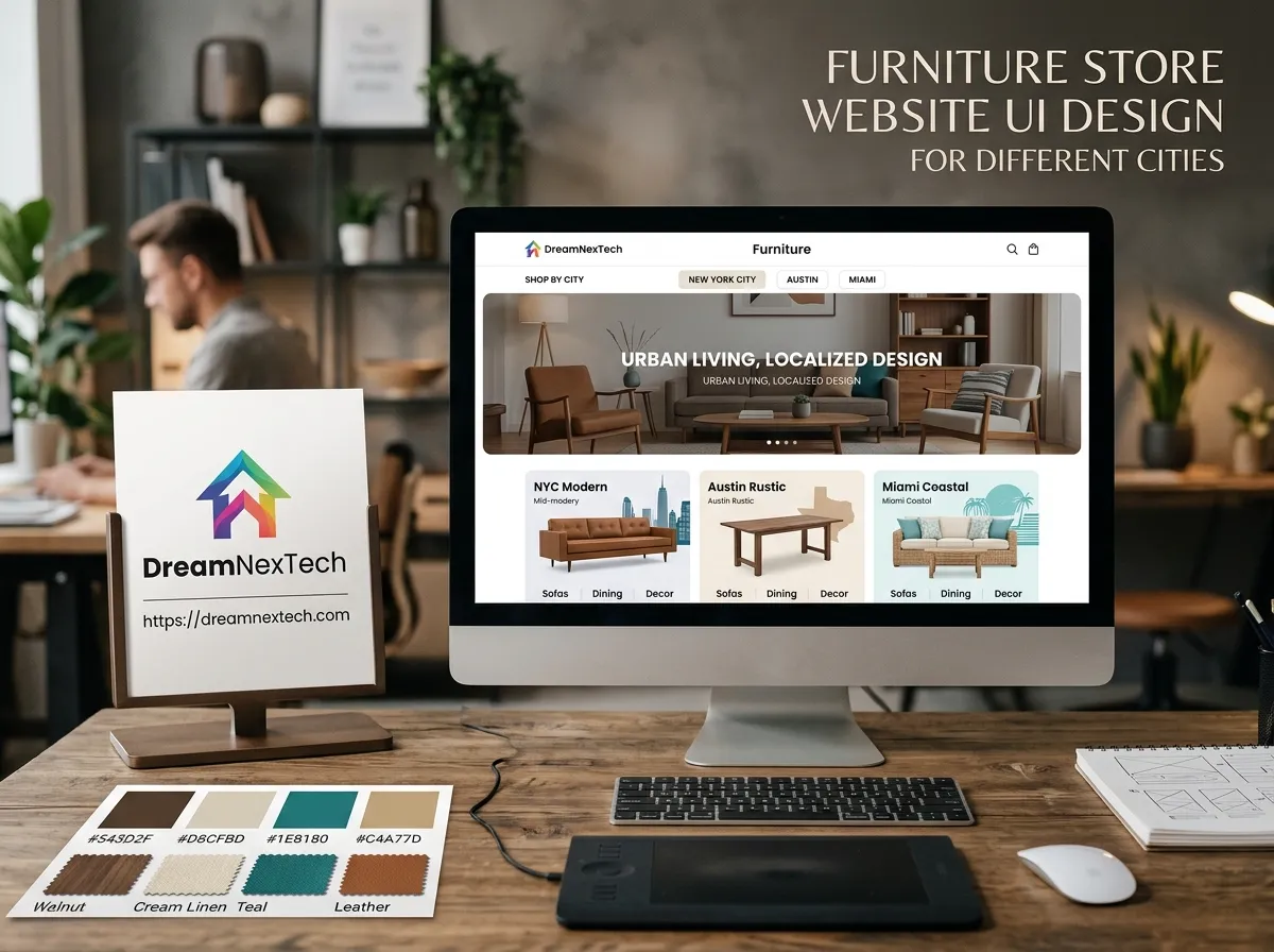
[…] Once the city is known, every product card and product page should show a real delivery estimate: “Delivered to Lahore in 3–5 days” or “In stock at DHA showroom.” This single UI element does more for high-ticket conversion than most redesigns. also check Furniture Website Design Services. […]