
Most decor brands spend weeks on product photography and about four minutes choosing a background. Then they wonder why the site looks flat.
Your background is the largest single visual element on your website. It covers more pixels than your logo, your hero image, and your entire product grid combined. Get it right and every product on the page looks more expensive. Get it wrong — a stock marble texture, a hard white, a full-width video that stutters — and you’ve undercut everything else you paid for.
Here is how to choose,Home Decor Website Background Ideas, and actually implement home decor website backgrounds that sell.
Hire Our Professional Services
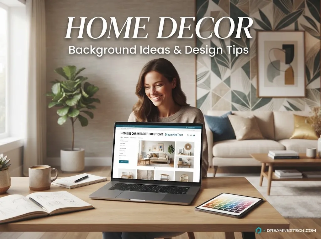
Home Decor Website Background Ideas & Design Tips
First Principle: The Background Is a Wall, Not a Feature
In a real showroom, nobody paints the wall neon. The wall exists to make the furniture look good. Your website background works the same way.
That gives you one test for every idea below: does this make the products in front of it look better, or does it compete with them? If it competes, it’s decoration, and decoration costs you sales.
The second test is speed. Backgrounds are where decor sites quietly lose their Core Web Vitals — a 4MB hero image or an autoplaying 20MB video will tank your rankings and your bounce rate together. check ou best home decore website design color palettes.
9 Home Decor Website Background Ideas That Work
1. Warm Off-White (the default that beats pure white)
Pure #FFFFFF is harsh and reads as “generic template.” Shift to #FAF7F2 or #FDFBF7 and the whole page softens. Product photos with white backgrounds still blend in, but the page feels curated rather than clinical.
Best for: minimal, Scandi, and modern decor brands.
2. Subtle Paper or Linen Texture
Take your warm neutral and layer a tileable texture at 3–6% opacity. The eye barely registers it consciously, but the page gains a tactile, physical quality — which is exactly what a decor brand is selling.
Keep the tile small (under 40KB) and repeat it. Never use a huge textured JPEG as a background.
3. Full-Bleed Lifestyle Hero
One large styled-room photograph behind your headline. This is the strongest emotional opener a decor site can have, but it needs three things: a dark or light overlay gradient for text readability, an art-directed mobile crop (never just squash the desktop image), and WebP/AVIF compression.
4. Split-Screen Background
Half colour block, half lifestyle image. It gives you a clean area for copy and a CTA while keeping the emotional pull of photography. Stacks neatly into two rows on mobile.
5. Soft Duotone Gradient
Very gentle gradients — cream into oat, stone into sage — add depth without texture files. Pure CSS, zero load cost, and they subtly guide the eye down the page toward your CTA.
Keep the two stops within a few shades of each other. Anything bolder looks like a 2015 SaaS site.
6. Dark Charcoal for Luxury
#1C1C1A with brass or bone type. Products glow against it. Two conditions: your photography must be consistent, and your body text must be large enough (16px+) to stay readable in light-on-dark, which is harder on the eye.
7. Sticky Image Panels with Scrolling Content
The background image stays fixed while product content scrolls over it, then swaps to a new scene. Excellent for lookbooks and room-by-room collections. Requires careful implementation to avoid janky scrolling on mobile — disable the effect below tablet width.
8. Muted Pattern Behind Section Blocks
Not the whole page — just one section. A faint terrazzo, arch, or botanical line pattern behind a testimonial block or newsletter signup adds interest without visual noise.
9. Short Ambient Video
A five-second loop of curtains moving or a candle flickering can be beautiful. Rules: muted, autoplay, loop, under 3MB, no audio, poster image fallback, disabled on mobile data. If you can’t meet all six, use a still image instead.
Hire Our Professional Services
Design Tips That Keep Backgrounds From Backfiring
Always overlay text-bearing images. A linear gradient from rgba(0,0,0,0.45) to transparent is usually enough. Never put white text directly on an unmodified photo and hope.
Alternate your section backgrounds. Base neutral → secondary tone → base → image section. This gives the page rhythm and tells shoppers where one idea ends and the next begins.
Don’t mix more than two background treatments per page. A textured hero, a gradient mid-section, a video block, and a pattern footer is four ideas fighting each other.
Art-direct mobile separately. The most common decor site failure is a beautiful wide hero where the mobile crop cuts the product out entirely. Serve a different crop with <picture> and srcset.
Respect reduced motion. Users with motion sensitivity should get a static background. One media query handles it.
Compress ruthlessly. Hero images under 250KB. Textures under 40KB. Video under 3MB. Lazy-load everything below the fold.
Quick Reference: Match the Background to the Brand
| Brand style | Background choice |
|---|---|
| Minimal / Scandinavian | Warm off-white, soft gradient |
| Handmade / artisan | Linen or paper texture |
| Luxury furniture & lighting | Dark charcoal with brass |
| Coastal / summer | Light cool neutral, airy hero |
| Vintage / eclectic | Muted pattern in single sections |
| Large ecommerce catalogue | Flat neutral, no texture, speed first |
The Mistakes That Cost Conversions
- Stock marble or wood textures that everyone else is also using
- Fixed background attachment on mobile (it breaks in most mobile browsers)
- Background images that push Largest Contentful Paint past 2.5 seconds
- Text placed over the busiest part of an image
- Background colours that clash with product photo backgrounds
- Patterns behind product grids, making thumbnails hard to scan
- No fallback colour, so users see a blank white flash while the image loads
Every one of these is an implementation problem, not a taste problem — which means every one of them is fixable in code.
Get Backgrounds That Look Designed and Load Fast
The gap between a background idea and a background that performs is entirely front-end work: responsive image sets, compression pipelines, overlay logic, breakpoint-specific crops, and motion handling.
That’s our specialty. DreamNexTech builds decor and ecommerce front-ends where the visuals stay beautiful and the performance scores stay green — from hero sections to full template systems. If you want it handled properly, our front-end web development service covers the whole build.
Send us your brand direction and your photography. We’ll turn it into a background system that works on every device and every connection speed.

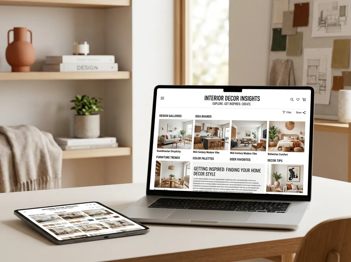

Best Home Decor Websites Services For Design Inspiration
[…] home decor website design background ideas. […]