
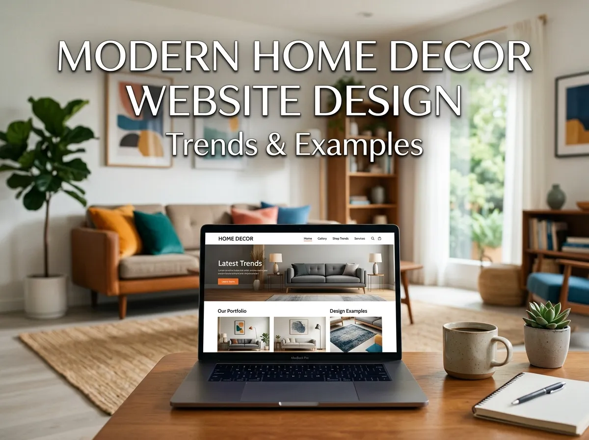
For home decor brands the stakes are higher than average, because your palette isn’t just branding — it’s a promise about taste. A shopper who sees a harsh blue-and-orange scheme assumes your candles smell cheap. A shopper who sees warm clay, soft oat, and a single deep accent assumes your candles cost $48. Neither of them has read a word yet.
So let’s fix the Best Home Decor Website Color Palettes for 2026 properly, with hex codes you can hand straight to a developer.
Hire Our Professional Services
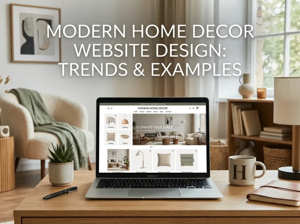
The Rule of Best Home Decor Website Color Palettes
Before the hex codes, understand the ratio. The strongest home decor website color palettes almost always follow 60 / 30 / 10:
- 60% dominant neutral — your background. Off-white, cream, warm grey, or deep charcoal.
- 30% secondary — section backgrounds, cards, footers, image frames.
- 10% accent — buttons, sale badges, links, hover states. Nothing else.
The mistake most decor sites make is spending the accent everywhere. When every element is coloured, your “Add to Cart” button competes with a banner, a badge, and a heading. Keep the accent scarce and it becomes a spotlight.
One more non-negotiable: your palette must not compete with your product photography. Decor products are already colourful and textured. The interface is the wall; the products are the art. also visit modren home decore design
7 Best Home Decor Website Color Palettes for 2026
1. Warm Minimal (the safest high-converting choice)
- Background:
#FAF7F2 - Secondary:
#EDE6DC - Text:
#2B2A28 - Accent:
#B5613C(terracotta)
Soft, warm, and photograph-friendly. Works for Scandinavian, modern minimal, and handmade decor brands. The terracotta CTA reads warm rather than aggressive, which suits browse-led shopping.
2. Quiet Luxury Charcoal
- Background:
#1C1C1A - Secondary:
#2A2926 - Text:
#F3F0EA - Accent:
#C9A227(brass)
For high-ticket lighting, furniture, and designer decor. Dark backgrounds make product imagery glow — but only if every product photo is shot on a consistent dark or transparent background. Mixed white-background photos on a dark site look broken instantly.
3. Sage & Stone
- Background:
#F5F5F0 - Secondary:
#DDE3D5 - Text:
#33372C - Accent:
#5E7355
Organic, calm, plant-forward. Ideal for sustainable decor, ceramics, and natural-material brands. Green accents test well for trust but slightly weaker for urgency, so pair with strong typographic CTAs.
4. Clay & Cream
- Background:
#FDFBF7 - Secondary:
#E8D9CC - Text:
#3A322C - Accent:
#9C5B44
The current default of the artisan decor world. Feels handmade, warm, and human. Add a subtle paper or linen texture at 3–5% opacity and it gains a tactile quality that flat colour can’t reach.
5. Coastal Soft Blue
- Background:
#FBFCFC - Secondary:
#DCE6E8 - Text:
#26343A - Accent:
#3C6E7F
For coastal, Hamptons, and light summer decor. Cooler palettes make rooms look airy but can read clinical — counter it with warm-toned product photography and a serif headline font.
6. Modern Mono with Ink Accent
- Background:
#FFFFFF - Secondary:
#F2F2F2 - Text:
#111111 - Accent:
#1F3A8A
Gallery-style. Best when your photography is genuinely excellent, because there is nowhere to hide. Highest contrast, strongest accessibility scores, cleanest conversion path.
7. Vintage Warm Plum
- Background:
#F7F2EE - Secondary:
#E4D6D2 - Text:
#2E2426 - Accent:
#6B3A4A
For vintage, maximalist, and eclectic decor shops. Deep, moody accent that suits antique and heritage inventory without turning the whole site dark.
Hire Our Professional Services
Choosing the Right Palette for Your Decor Niche
| Your inventory | Palette to pick |
|---|---|
| Minimal / Scandi homeware | Warm Minimal |
| Luxury lighting & furniture | Quiet Luxury Charcoal |
| Ceramics, plants, sustainable goods | Sage & Stone |
| Handmade, artisan, small-batch | Clay & Cream |
| Coastal, summer, light textiles | Coastal Soft Blue |
| Designer, gallery, high-end art | Modern Mono |
| Vintage, antique, eclectic | Vintage Warm Plum |
If your catalogue spans several of these, choose the neutral from one and the accent from another — but never mix two accents.
Accessibility Isn’t Optional
Beige on cream looks beautiful in a mood board and fails in the browser. Run every text-on-background pair through a contrast checker:
- Body text needs 4.5:1 minimum
- Large headings need 3:1 minimum
- Buttons need contrast against their background and readable label text
Decor sites fail this constantly because designers fall in love with tone-on-tone. The fix is simple: keep your body text near-black or near-white and reserve the soft tones for surfaces, not type.
Also define hover, active, and disabled states for your accent colour. A button that doesn’t visibly respond feels broken, and broken feels untrustworthy at checkout.
Implementing the Palette Without Breaking the Build
A palette is only as good as its implementation. In practice that means:
- Define every colour as a CSS custom property (
--clr-bg,--clr-accent) so a rebrand is a one-line change, not a two-day hunt. - Test the palette in dark mode — many shoppers browse with system dark mode on, and an unhandled decor site can invert into something unrecognisable.
- Check colours against real product photos, not placeholders. A palette that sings next to stock images can clash with your actual inventory.
- Verify on real devices. Warm creams shift noticeably between OLED phones and older laptop panels.
This is where most DIY palette work falls apart — the colours are right, but the front-end implementation is inconsistent across breakpoints, and the site slowly drifts into four shades of almost-the-same-beige.
Get Your Palette Built, Not Just Picked
Choosing a palette takes an afternoon. Implementing it cleanly across every template, state, and screen size takes a developer who works in design systems rather than one-off CSS.
DreamNexTech handles both. We turn your palette into a documented, variable-driven system and apply it across your full site — including responsive web page design and editing so your colours hold up from a 320px phone to a 27-inch display.
Send us your brand colours or your inventory photos, and we’ll build the palette around what you actually sell.
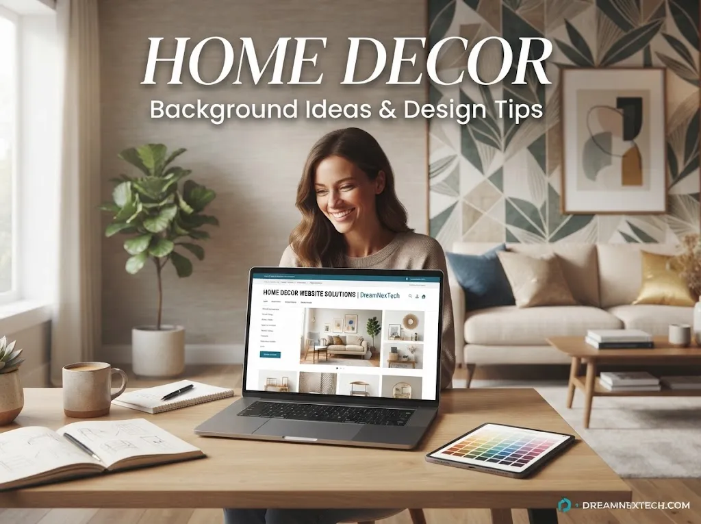
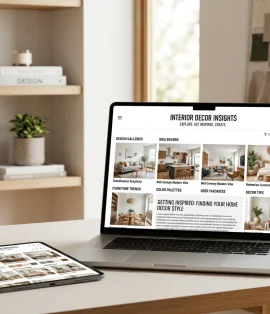
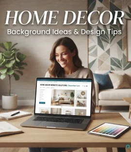
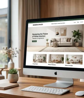
Home Decor Website Background Ideas & Design Tips
[…] The second test is speed. Backgrounds are where decor sites quietly lose their Core Web Vitals — a 4MB hero image or an autoplaying 20MB video will tank your rankings and your bounce rate together. check ou best home decore website design color palettes. […]