
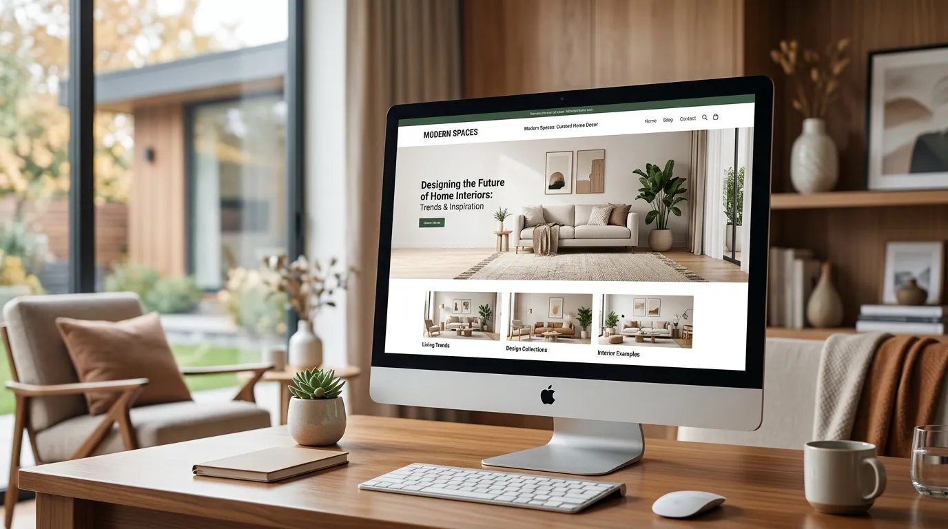
Your customers decide whether your decor brand is worth their money in under three seconds — and they decide it before they read a single word. They look at your homepage the same way they look at a living room: is this beautiful, is this calm, does this feel expensive? If the answer is no, they close the tab and buy the throw pillow somewhere else.
That is the uncomfortable truth about modern home decor website design. In this industry, the website is the showroom. A cluttered header, a stretched product photo, or a font that belongs on a plumbing site quietly tells visitors your products are cheap — even when they aren’t.
The good news: the design rules that make decor sites convert are well documented, and they are not expensive to implement when they’re built right the first time.
Hire Our Professional Services
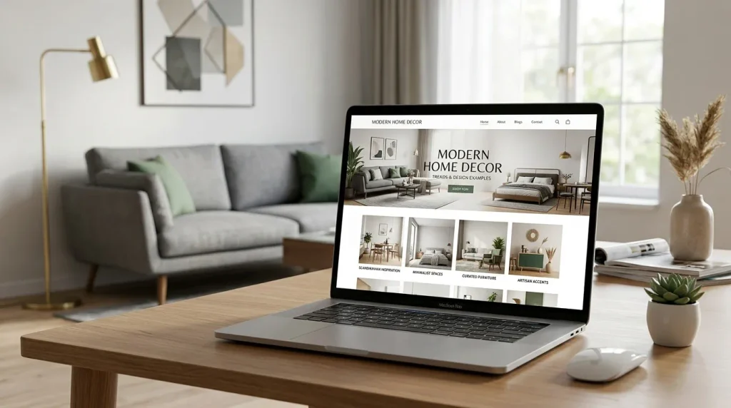
Why Home Decor Websites Follow Different Design Rules
Most ecommerce advice assumes people shop by specification. Decor doesn’t work that way. Nobody compares the tensile strength of two ceramic vases. They buy the feeling — the room they imagine after the vase arrives.
That changes everything about your layout:
- Imagery outranks copy. Your product photography carries 70% of the persuasion.
- Whitespace signals price. Tight, crowded grids read as discount. Generous spacing reads as premium.
- Browsing beats searching. Decor shoppers wander. Your navigation must reward wandering, not punish it.
- Context sells the product. A lamp on a white background is a lamp. A lamp in a styled corner is a mood.
Any modern home decor website design images that ignores those four points will underperform no matter how much traffic you push at it.
Modern Home Decor Website Design
1. Editorial Hero Sections Instead of Sliders
Rotating sliders are dead. They slow your site down, hurt Core Web Vitals, and almost nobody sees slide three. Modern decor brands use one full-bleed lifestyle image, a short headline, and a single call to action.
Think magazine cover, not carousel. A quiet hero section with “Warm minimal pieces for slow mornings” and a Shop the Collection button will beat five rotating promo banners every time.
2. Asymmetric and Broken-Grid Layouts
Perfectly uniform product grids feel like a catalogue. Broken grids — where one image spans two columns and the next sits offset with whitespace beside it — feel curated. This is one of the fastest ways to make a small decor catalogue look like a design house.
Use it on collection pages and the homepage, but keep the actual product listing grid consistent so shoppers can scan.
3. Shoppable Room Scenes
Instead of listing products, show a styled room and place small hotspots on each item. Tap the hotspot, get the product card, add to cart. Average order value climbs because people buy the set, not the single piece.
This is a development-heavy feature and it needs to be built responsively, which is exactly where a specialist matters more than a template.
4. Muted, Earth-Led Palettes with One Accent
Clay, oat, sage, warm off-white, charcoal — the 2026 decor web palette is soft and tactile, with a single saturated accent reserved for buttons and sale tags. It keeps the interface calm and makes your CTAs impossible to miss.
5. Serif Headlines, Sans-Serif Body
A high-contrast serif headline paired with a clean, readable sans-serif body is the current signature of premium decor branding. It reads as heritage plus modern.
6. Micro-Interactions and Subtle Motion
Gentle fade-ins as products scroll into view, a soft zoom on image hover, a cart drawer that slides instead of jumping. These small details are what separate a “nice template” from a site that feels crafted — and they cost very little to add during build.
7. Speed as a Design Feature
Decor sites are image-heavy by nature, which makes them slow by default. Modern builds use WebP or AVIF images, lazy loading, responsive image sets, and a lean theme. A gorgeous site that takes six seconds to load is a gorgeous site nobody sees.
Hire Our Professional Services
Home Decor Website Design Examples: What They Get Right
You don’t need to guess. Look at the patterns the strongest decor brands share:
The minimal Scandinavian store. One hero image, three collection tiles, a short brand story, an Instagram strip, footer. Five sections total. The restraint is the design.
The luxury interiors brand. Dark charcoal background, gold or brass accent, large serif type, very slow scroll rhythm with lots of vertical breathing room. Products are shown one at a time, like exhibits.
The handmade/artisan shop. Warm cream background, textured paper or linen overlay, hand-drawn icons, maker photos. Personality sells the premium, not gloss.
The high-volume decor marketplace. Denser grid, persistent filters, sticky add-to-cart, strong search. Here usability outranks mood — but the palette stays soft so the density doesn’t feel cheap.
Pick the model closest to your brand and build against it deliberately, rather than assembling features from ten different sites.
The Structure That Converts
A decor homepage that sells usually runs in this order:
- Hero — one lifestyle image, one promise, one button
- Shop by category — three to four large visual tiles
- Featured collection — six to eight products, broken grid
- Brand story — two sentences and a photo, not an essay
- Social proof — reviews or user photos
- Room inspiration — shoppable scene or lookbook link
- Email capture and footer
Every additional section past this dilutes attention. If a block doesn’t move someone toward a product, cut it.
Don’t Ship These Mistakes
- Mixed photo styles — some white background, some lifestyle, different lighting on each
- Text over busy images with no overlay, killing readability
- Mobile layouts where the product image gets cropped awkwardly
- Six fonts, four button styles, three shades of “brand” beige
- No sticky add-to-cart on mobile product pages
- Ignoring alt text and schema, which costs you decor-related search visibility
Build It Properly, Once
The difference between a decor site that looks expensive and one that looks like a template is almost always execution: spacing consistency, image optimisation, responsive behaviour, and clean front-end code. Those are build decisions, not theme decisions.
At DreamNexTech, we build decor and ecommerce sites that hold their design integrity on every screen size — from custom front-end work to complete website development handled end to end. You bring the products and the photography; we handle the layout system, the speed, and the conversion path.
If your current site doesn’t look like it sells what you actually sell, that’s a fixable problem — and usually a fast one.

Best Home Decor Website Color Palettes For 2026
[…] One more non-negotiable: your palette must not compete with your product photography. Decor products are already colourful and textured. The interface is the wall; the products are the art. also visit modren home decore design […]