
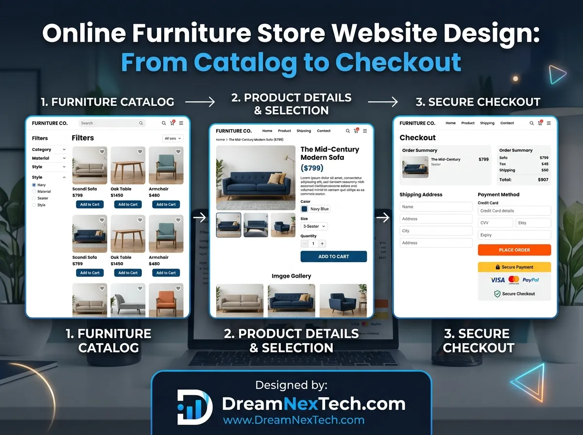
Somewhere between your homepage and your thank-you page, most of your revenue disappears. Industry averages put furniture ecommerce cart abandonment north of 70%. That is not a marketing problem. That is a path problem — and the path is your website.
This is a walkthrough of that entire path, stage by stage, with the specific Online Furniture Store Website Design decisions that keep shoppers moving from catalogue to checkout instead of quietly closing the tab.

Hire Our Professional Services
Online Furniture Store Website Design
Stage 1: The Catalogue Structure
Before a single pixel gets designed, the catalogue architecture has to be right. Furniture catalogues are messy by nature — one product might belong under “Sofas,” “Living Room,” “Modular,” and “Sale” simultaneously.
Get three things right:
Primary navigation by room, secondary by product type. People think “I need something for the bedroom” before they think “I need a nightstand.” Room-first navigation matches that.
A filter taxonomy planned as data, not as UI. Material, colour family, dimensions, seating capacity, style, price band, delivery speed, stock status. Every one of these should exist as a structured attribute in your product data — otherwise your filters will be inconsistent and your search will be useless.
Clean, stable URLs. /living-room/sofas/3-seater/ beats /category?id=447&f=12. Readable URLs help SEO, help analytics, and help customers share products.
Stage 2: Category and Collection Pages
This is where browsing becomes shortlisting. The category page has to do three jobs at once: show enough products to feel like a real selection, let people narrow quickly, and load fast despite being image-heavy.
Design decisions that pay off:
- Grid density that adapts — 4 columns on desktop, 2 on mobile, never 1
- Sticky filter access on mobile — a persistent “Filter” button, not a control buried at the top
- Applied filters shown as removable chips so shoppers always know what they are looking at
- Infinite scroll with a load-more fallback and preserved scroll position on back-navigation (this one detail alone recovers a surprising amount of lost sessions)
- Short, useful category intro copy placed above or below the grid for search relevance without pushing products off-screen
Stage 3: The Product Page
The highest-value screen you own. Structure it deliberately:
Gallery. Minimum six images. Include a scale shot with a human or standard doorway, a close-up of the material, a rear or underside view, and a styled room context. Zoom must be smooth. 360° views convert well on upholstered items.
Above-the-fold essentials. Name, price, financing option, key variant selectors (fabric, finish, configuration), stock status, delivery estimate, and add-to-cart. Everything else can wait.
Dimensions as a diagram. A labelled line drawing with width, depth, height, seat height, and arm height beats a paragraph of numbers every single time. Include doorway clearance guidance.
Delivery estimator by postcode. Real dates, calculated live. Ambiguity here is the number one killer of high-ticket carts.
Materials, construction, and care. Frame type, filling, fabric grade, cleaning instructions, warranty length.
Reviews with customer photos. Sorted with photo reviews first. This is the strongest proof you own.
Related and complete-the-room modules. Furniture cross-sells naturally — coffee table with sofa, nightstands with beds. Placed well, these lift average order value meaningfully. check out furniture store website design.
Hire Our Professional Services
Stage 4: The Cart
Furniture carts are small — often a single item — and enormously valuable. Treat them accordingly.
- Show a thumbnail, selected options, and dimensions for each item so shoppers can confirm at a glance
- Display delivery cost and estimated date in the cart, not at the final checkout step
- Offer assembly, protection plans, and old-furniture removal as clear add-ons
- Include a “save for later” option — on high-ticket items, this recovers sales that a hard exit would lose
- Keep trust badges visible: secure payment, return window, warranty
A side-drawer cart works well for browsing. A full cart page works better for high-ticket review. Many strong furniture sites use both.
Stage 5: Checkout
Every additional field is an opportunity to lose the order. The rules:
- Guest checkout, always. Offer account creation after purchase, not before.
- Three visible steps — delivery, payment, review — with a progress indicator.
- Address autocomplete to cut typing and reduce failed deliveries.
- Delivery date selection where you can offer it. Furniture buyers need to be home; letting them choose removes a genuine objection.
- All payment and financing options shown upfront, with logos.
- No surprises. Every cost visible before the final button.
- Mobile-optimised inputs — correct keyboard types, large tap targets, no zoom-on-focus.
Building this cleanly across CMS, payment gateway, and delivery logic is where most projects go wrong. If you want the whole stack handled — including WordPress and WooCommerce setups for retail brands — that is covered by our business and WordPress website development service.
Stage 6: Post-Purchase
The sale is not the end of the design work. Furniture has a long fulfilment window, and silence during that window generates support tickets and cancellations.
- Immediate confirmation with a clear delivery timeline
- Order tracking accessible without login
- Proactive updates at dispatch and out-for-delivery
- A post-delivery review request with a photo upload prompt
- Care instructions delivered by email a week after arrival
Well-handled post-purchase experience is where repeat business and referrals come from — and furniture customers refer heavily.
Measure the Path, Not Just the Destination
Track every stage: category page engagement, filter usage, product page scroll depth, gallery interaction, delivery estimator usage, cart adds, checkout step drop-off. When conversion dips, this data tells you exactly which stage broke. Without it, you are guessing.
An online furniture store website design that respects every stage of this path converts far better than one that only polishes the homepage. The path is the product.





Furniture Ecommerce Store Website Development
[…] Get this right and everything downstream — filters, search, feeds, recommendations — becomes straightforward. Get it wrong and every feature you add fights the data. Furniture design services. […]