
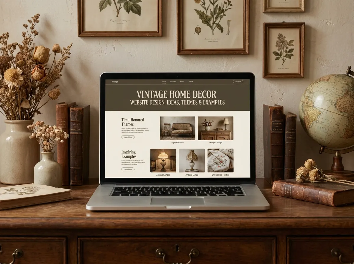
Your customers can smell a mass-produced website the same way they can spot a fake “distressed” dresser from three feet away. That’s the whole problem with selling vintage online: the product promises soul, patina, and history and then the website looks like a stock template with a stock font and a stock hero image. The mismatch kills trust before the visitor ever reaches your collection page.
If you sell restored furniture, antique mirrors, reclaimed wood pieces, or curated mid-century finds, your site has to feel like the shop. Below are the ideas, themes, and real design patterns that make a Vintage Home Decor Website Design convert plus the layout decisions most store owners get wrong.

Hire Our Professional Services
What Makes a Vintage Home Decor Website Design Different
A modern minimal decor brand can get away with white space and a sans-serif logo. Vintage can’t. The aesthetic itself is your differentiator, so every design element has to carry the era you’re selling.
Three things separate a vintage home decor website design from a generic ecommerce build:
Texture over flatness. Flat colour blocks read as “SaaS startup.” Subtle paper grain, linen backgrounds, aged-cream panels, and soft drop shadows read as “curated antiques.”
Editorial layout, not grid dump. Vintage buyers browse emotionally. They want the story of the piece — where it came from, what decade, what it was restored from. A rigid four-column product grid flattens that story.
Photography as architecture. In vintage, the photo is the product page. Styled room shots, close-ups of brass hardware, honest detail shots of wear — these belong in the layout structure itself, not tucked into a gallery tab.
Vintage Home Decor Website Theme Ideas That Actually Work
1. The Curated Catalog
Built around large, generous product cards with plenty of breathing room. Each item gets a short provenance line — “1960s teak sideboard, Danish, restored 2026.” Works beautifully for one-of-one inventory where you sell single pieces rather than stock quantities.
2. The Warm Editorial
A magazine-style home decor website theme with a full-bleed hero, a featured story block, and shoppable room scenes below. This layout wins on time-on-page because visitors scroll like readers, not shoppers. It also gives you natural placement for blog content, which does real work for SEO.
3. The Antique Marketplace
For sellers with deep, varied inventory: strong filtering by era, material, and room, plus a sticky sidebar. This one lives or dies on technical execution — filters must be fast, mobile-friendly, and indexable. A slow filter is a lost sale.
4. Dark Heritage
Deep charcoal or forest-green backgrounds, warm gold accents, ivory serif headings. Excellent for luxury vintage lighting, chandeliers, and statuary. Contrast ratios need careful handling here so text stays accessible.
5. Farmhouse Reclaimed
Off-white, muted sage, soft terracotta, hand-drawn dividers. Pairs naturally with rustic home decor website templates and reclaimed-wood inventory.
The Vintage Colour Palette Formula
Skip the pure white background. It’s the single fastest way to make antique inventory look cheap.
Instead, build your home decor website colour palette on three layers:
- Base: warm neutral — bone, oat, aged parchment, or soft taupe
- Depth: one grounded dark — walnut brown, charcoal, deep olive, ink navy
- Accent: one metallic or saturated pop — antique brass, oxidised copper, burgundy, mustard
Two fonts maximum. A high-contrast serif for headings (think old signage) plus a clean, quiet sans-serif for body copy and buttons. Never set body text in a decorative script — it looks period-correct and reads terribly.
Home Decor Website Header and Hero Design
Your header has one job: prove instantly that this is a real, credible shop with real, unusual inventory.
The strongest vintage home decor website header design keeps navigation short — Shop, Collections, About, Journal, Contact — with a visible search icon and cart. Mega menus organised by room (“Living, Dining, Bedroom, Lighting, Wall”) consistently outperform menus organised by era, because most buyers shop by need first and taste second.
For the hero section, a styled room photograph beats a product-on-white every time. Overlay a single line of copy and one button. Two competing CTAs in a hero cut click-through, not double it. If you need help translating a design concept into a fast, pixel-accurate front end, our team handles exactly that kind of build — see our responsive web page design and editing service.
Product Pages: Where Vintage Stores Lose Money
Generic ecommerce product pages assume infinite stock and standard sizing. Vintage assumes neither. Your product template needs:
- Dimensions in a clear table — vintage buyers are measuring doorways and alcoves
- Condition notes, stated honestly — visible wear disclosed upfront reduces returns dramatically
- Provenance and era — the story is a large part of the price
- Shipping and handling specifics — freight for large furniture, packing method for fragile glass
- “One available” scarcity marker — genuine urgency, not a fake countdown timer
Add a “Recently sold” section rather than hiding sold pieces. It proves demand and shows the depth of what you source.
Hire Our Professional Services
Real-World Examples Worth Studying
You don’t need to copy anyone — but you should study the patterns that repeat across successful vintage and antique home decor websites:
Chairish uses aggressive, well-built filtering and treats each listing like a dealer catalogue entry. Note how quickly the filters respond.
Anthropologie Home proves warm neutrals and editorial photography can scale to a large catalogue without feeling cluttered.
Rejuvenation blends heritage lighting with modern ecommerce UX — clean specs, clear shipping, period-accurate photography.
Etsy vintage shops that convert well almost always share one trait: the shop banner and first three photos establish the aesthetic in under two seconds.
The lesson across all four: consistency beats decoration. Pick a palette, a type pairing, and a photography style, then never break them.
Technical Details That Protect Your Rankings
Beautiful and slow is still a losing website. Vintage sites are image-heavy by nature, so performance work isn’t optional:
- Serve WebP or AVIF with proper
srcsetsizing - Lazy-load everything below the fold
- Compress those large room photographs before upload, not after
- Keep custom fonts to two weights maximum
- Add Product and Organization schema so Google understands your listings
- Write descriptive alt text — “1970s brass floor lamp with fluted glass shade,” not “IMG_4471”
Mobile deserves special attention. More than half your traffic will browse from a phone, often mid-scroll from Pinterest or Instagram. Sticky “Add to cart,” thumb-reachable filters, and a fast first paint matter more than any desktop flourish.
Turning Design Into Revenue
A vintage home decor website design succeeds when three things line up: the aesthetic matches the inventory, the product pages answer every objection before it’s asked, and the site loads fast enough that nobody leaves waiting.
That’s a build, not a template swap. If you’d rather have it done properly the first time — custom theme, responsive front end, optimised product templates, and clean code you can actually maintain — bring it to us.





Home Decor Website Themes Services - DreamNexTech
[…] Anything that fails two of these will cost you more in lost conversions than it saved you at purchase. also check home decor website services. […]